Delibros
2025
Burger restaurant
Services
→ Brand Identity
→ Positioning
Challenge
As one of the pioneers of the artisanal burger scene in Tirana, Delibros quickly became a reference point for quality and character. Its bold blue identity helped define a new standard in the city’s fast-casual dining culture, making the brand instantly recognizable and deeply rooted in the urban lifestyle.
Over time, however, the local market evolved. As more restaurants embraced similar visual cues, the once-distinctive blue lost its exclusivity. This shift challenged Delibros to rethink how it could once again stand out, not just through color, but through a stronger, more mature expression of its personality, values, and attitude.
Delibros is more than a burger place. It is a statement of taste, authenticity, and confidence, born in Tirana, shaped by its people, and ready to redefine its presence in a competitive and ever-changing city.
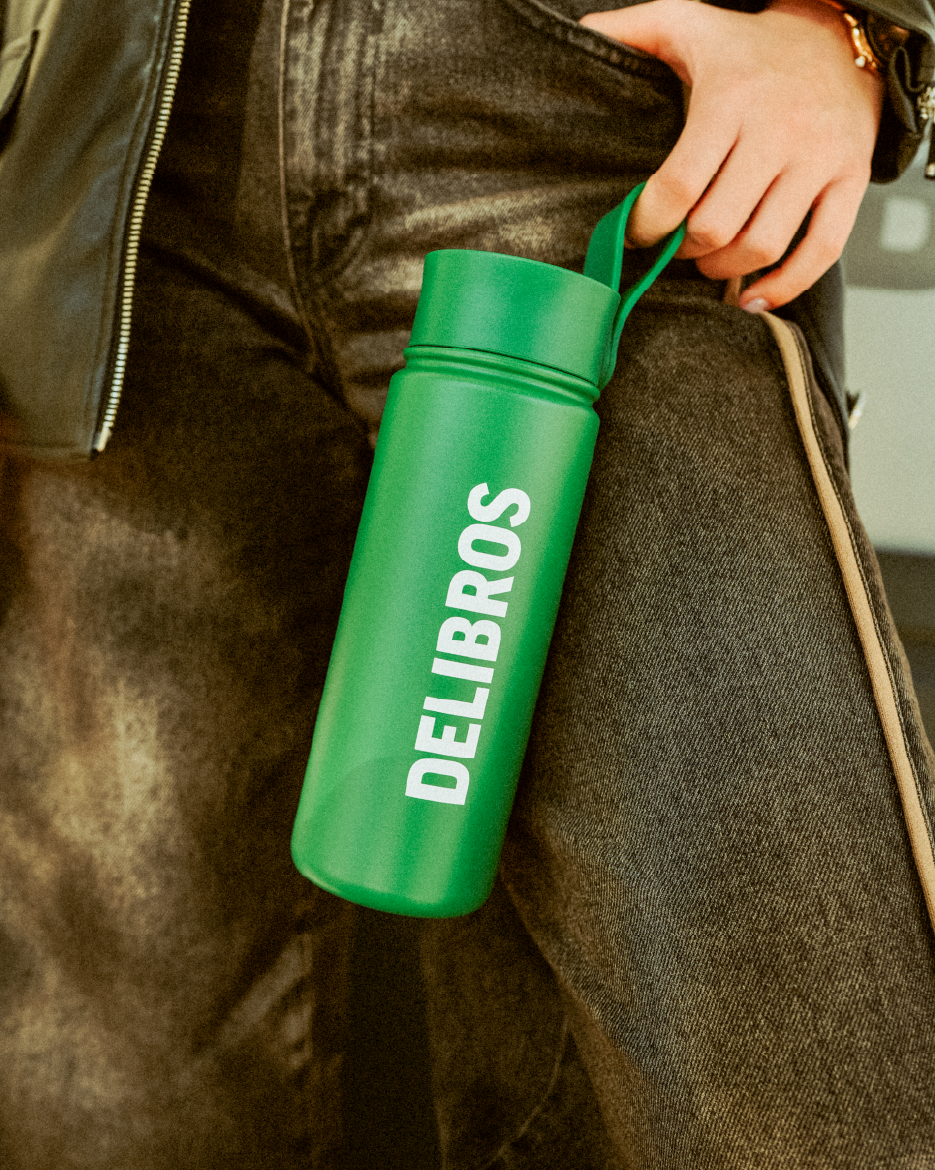
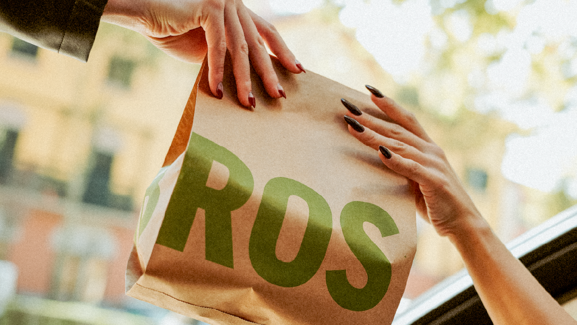
To restore Delibros’ distinctiveness, we introduced a bold new green identity, an unexpected yet powerful choice within the Albanian food scene. Fresh, vibrant, and confident, green immediately sets Delibros apart, breaking away from visual sameness and re-establishing the brand as instantly recognizable.
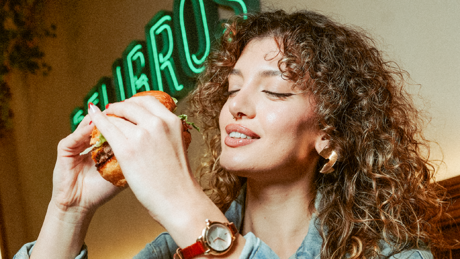
More than a color shift, this new identity reinforces Delibros’ original spirit: authentic, energetic, and unapologetically unique. Green gives the brand back its voice, helping Delibros reclaim its position as a true original in Tirana’s competitive burger culture.
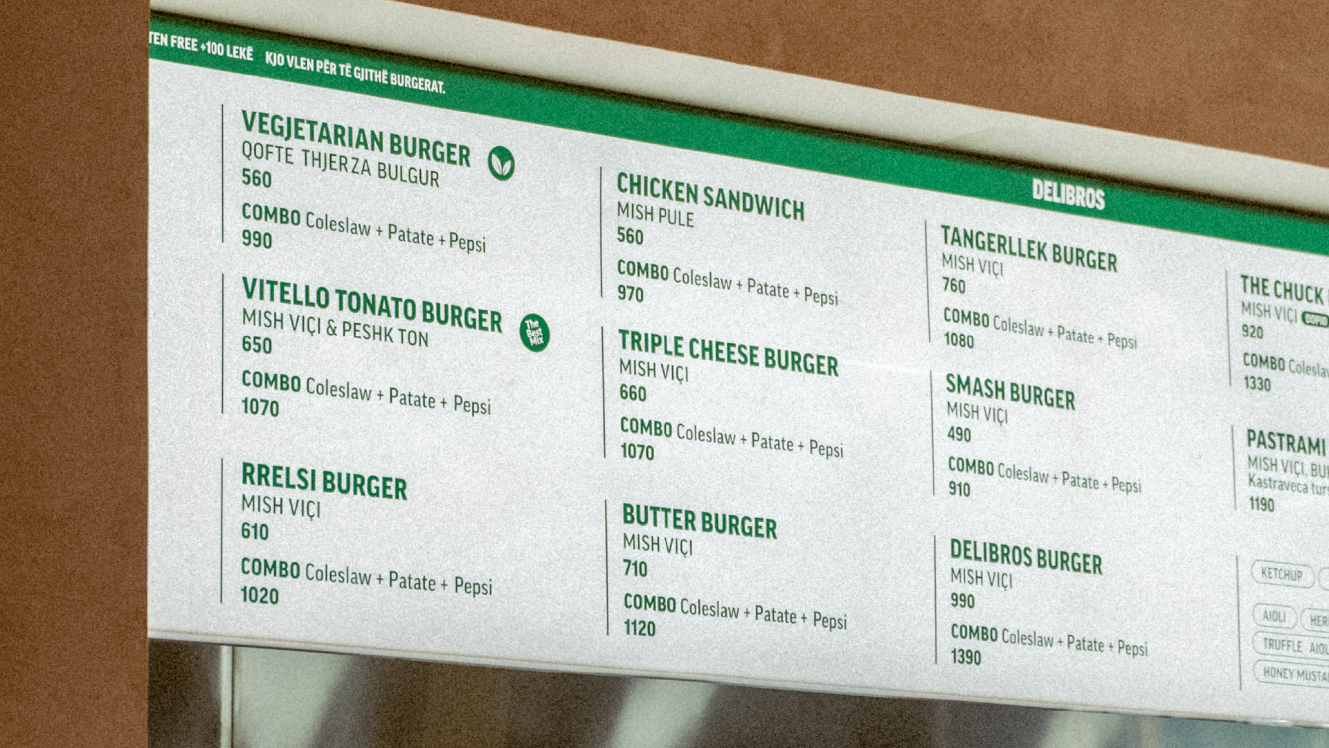
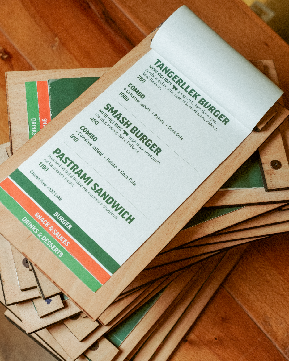
By maintaining a clean layout and a restrained typographic approach, we ensured that nothing distracts from what truly matters: the taste and the product itself. This clarity allows the food to take center stage, while creating a faster, more intuitive reading experience that supports confident and effortless ordering decisions.
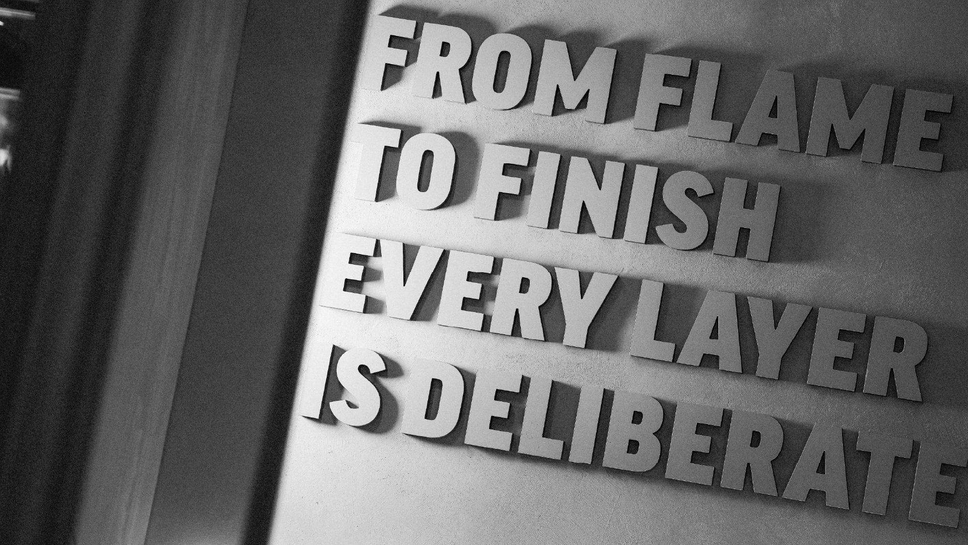
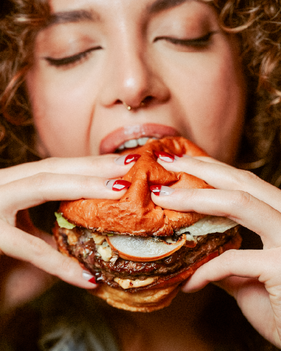
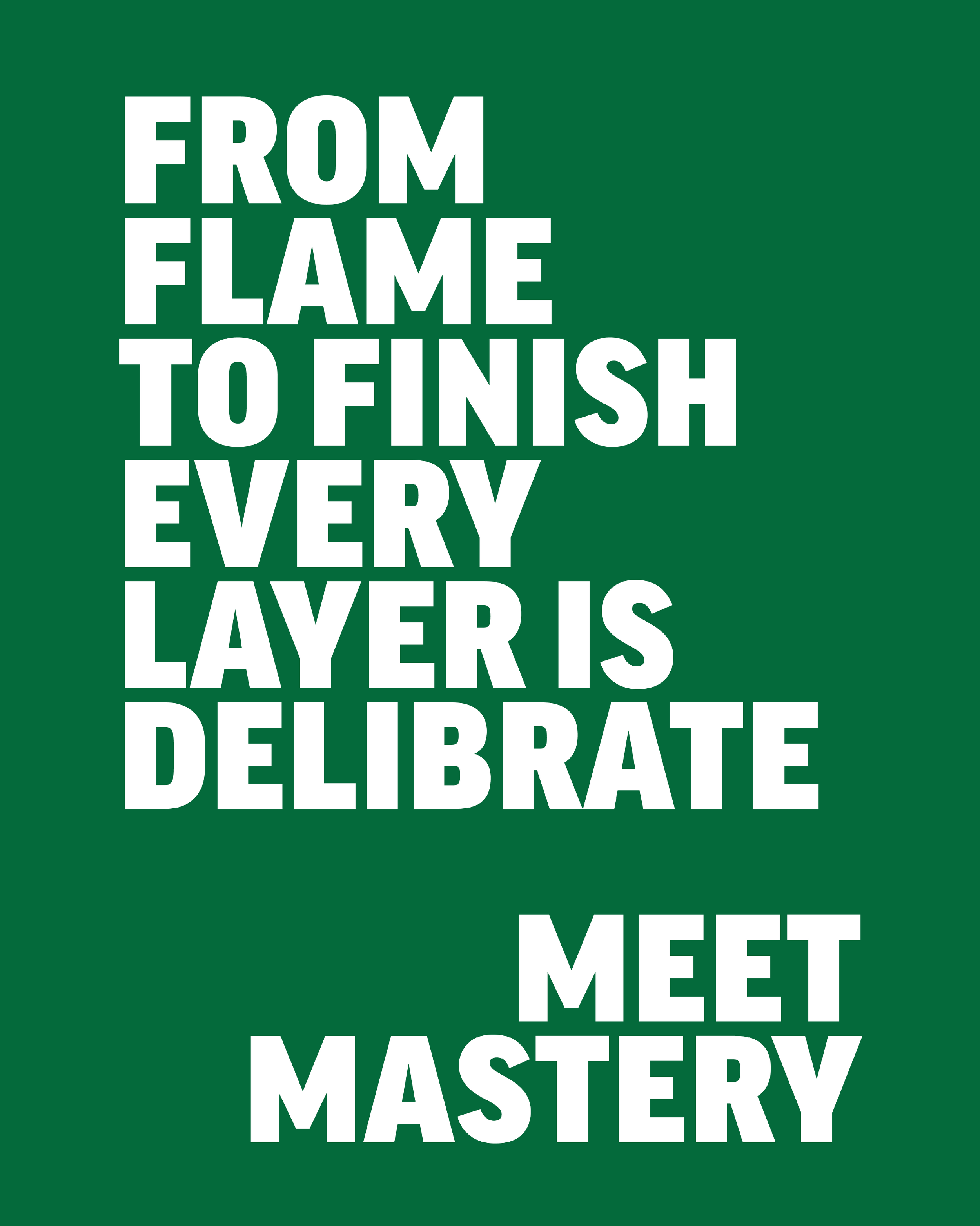
From flame to finish, every layer is deliberate. Carefully grilled, thoughtfully assembled, and built to be felt in every bite. This is where instinct meets precision, and appetite meets intention. Meet Mastery.
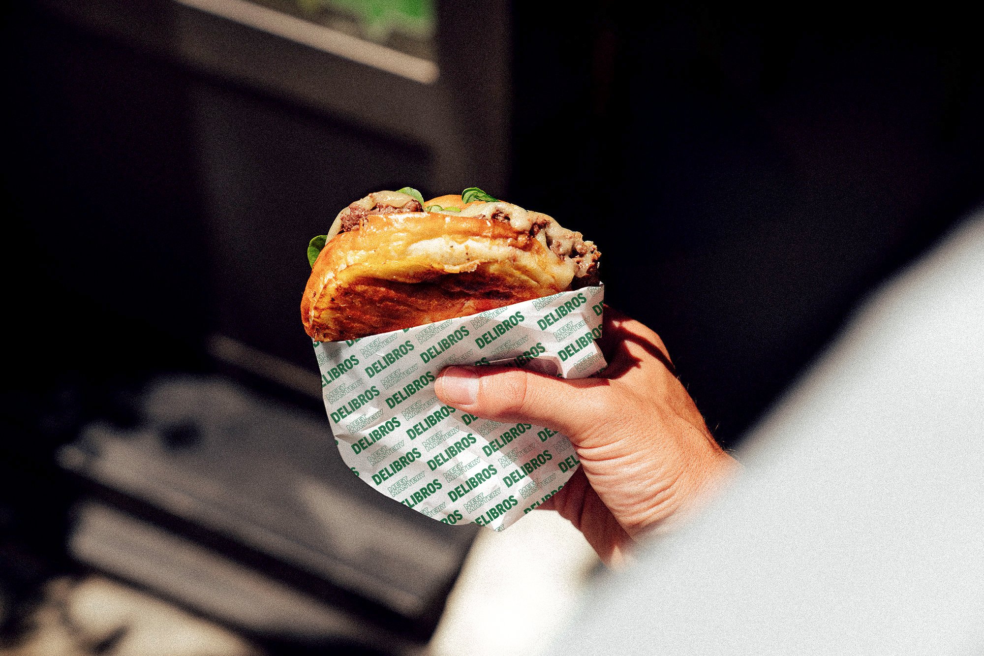
Applying the logo as a pattern across the packaging reinforces the brand’s identity while preserving its distinctive character. This approach creates visual consistency, strengthens recognition, and allows the brand to express itself in a subtle yet confident way.
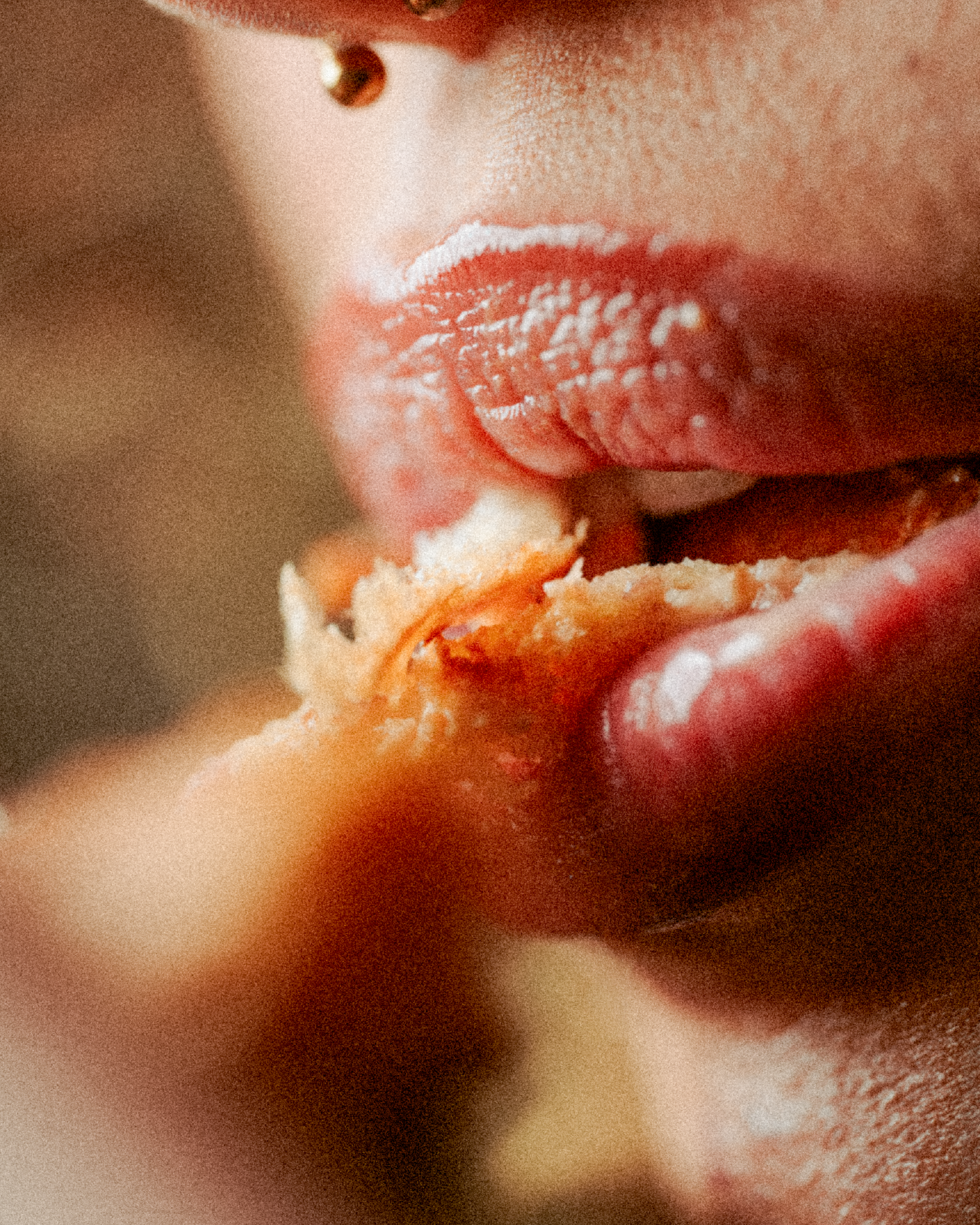
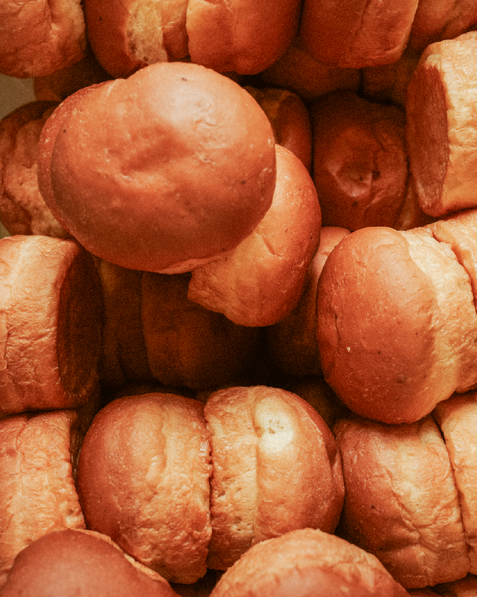
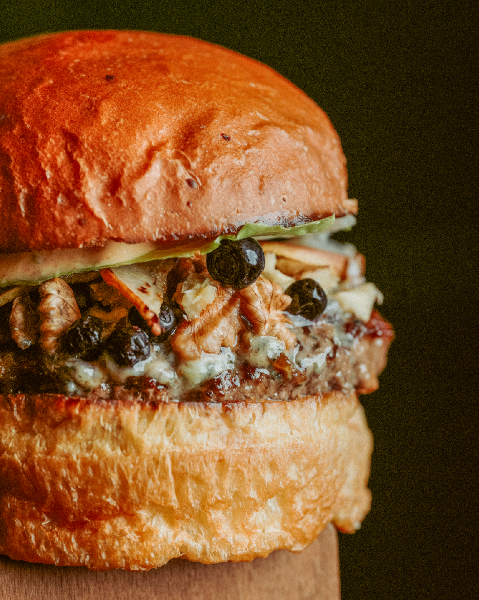
The visual language balances appetite and structure. While the food photography celebrates richness, texture, and indulgence, the menu design brings clarity and order. A clean layout, strong hierarchy, and restrained typography guide the eye effortlessly, making choices immediate and confident.
The in-store branding features the statement “From Flame to Finish, Every Layer Is Deliberate” as a permanent wall installation. More than decoration, it acts as a manifesto, communicating Delibros’ philosophy of craftsmanship, intention, and mastery at every step of the process.
Integrated into the space, the message reinforces the brand’s values while creating a strong emotional and visual connection with the customer, turning the environment itself into part of the brand experience.