Ola
2025
Food Industry
Services
→ Brand Identity
→ Positioning
→ Packaging
Challenge
OLA is an established food brand under Atlas Mills, a company widely recognized in Albania for its expertise and leadership in flour production. Until now, Atlas Mills’ core category has been flour, where the brand has built strong trust, visibility, and recognition among Albanian consumers.
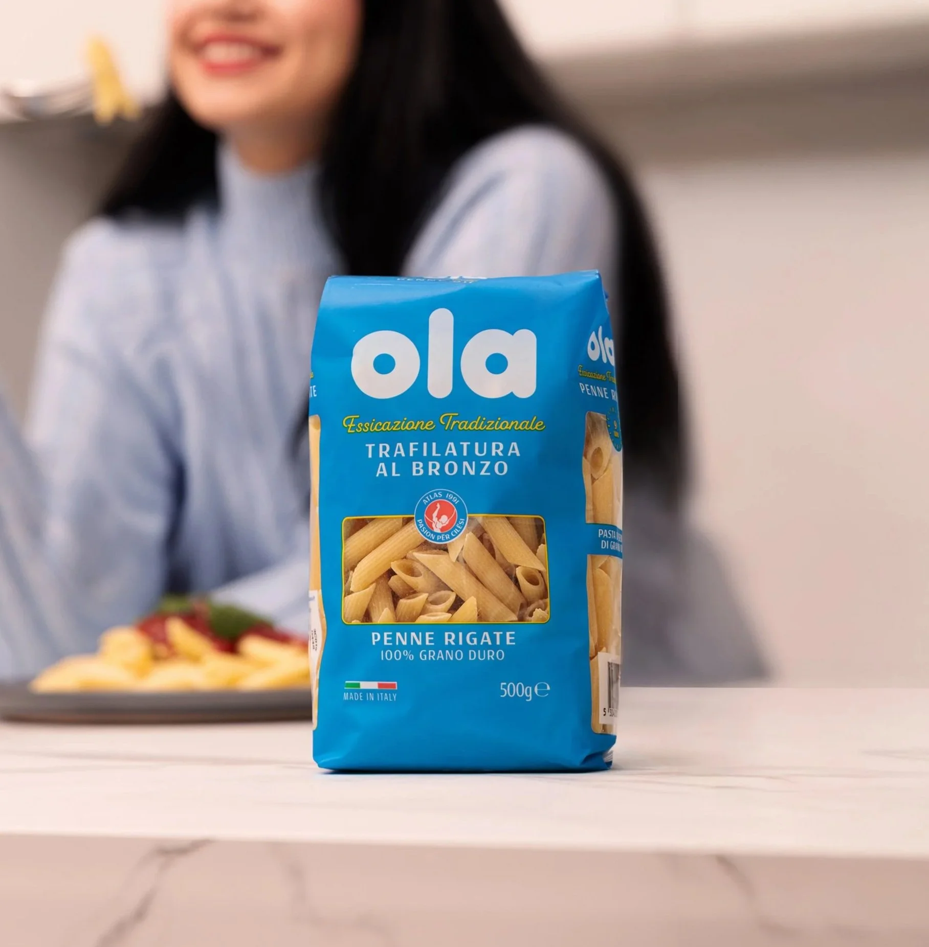
With the launch of OLA Pasta, the brand enters a new product category for the Albanian market, extending its portfolio with a high-quality, everyday premium pasta product. This launch represents a strategic evolution for Atlas Mills, positioning OLA not only as a flour specialist, but as a broader, quality-driven food brand.
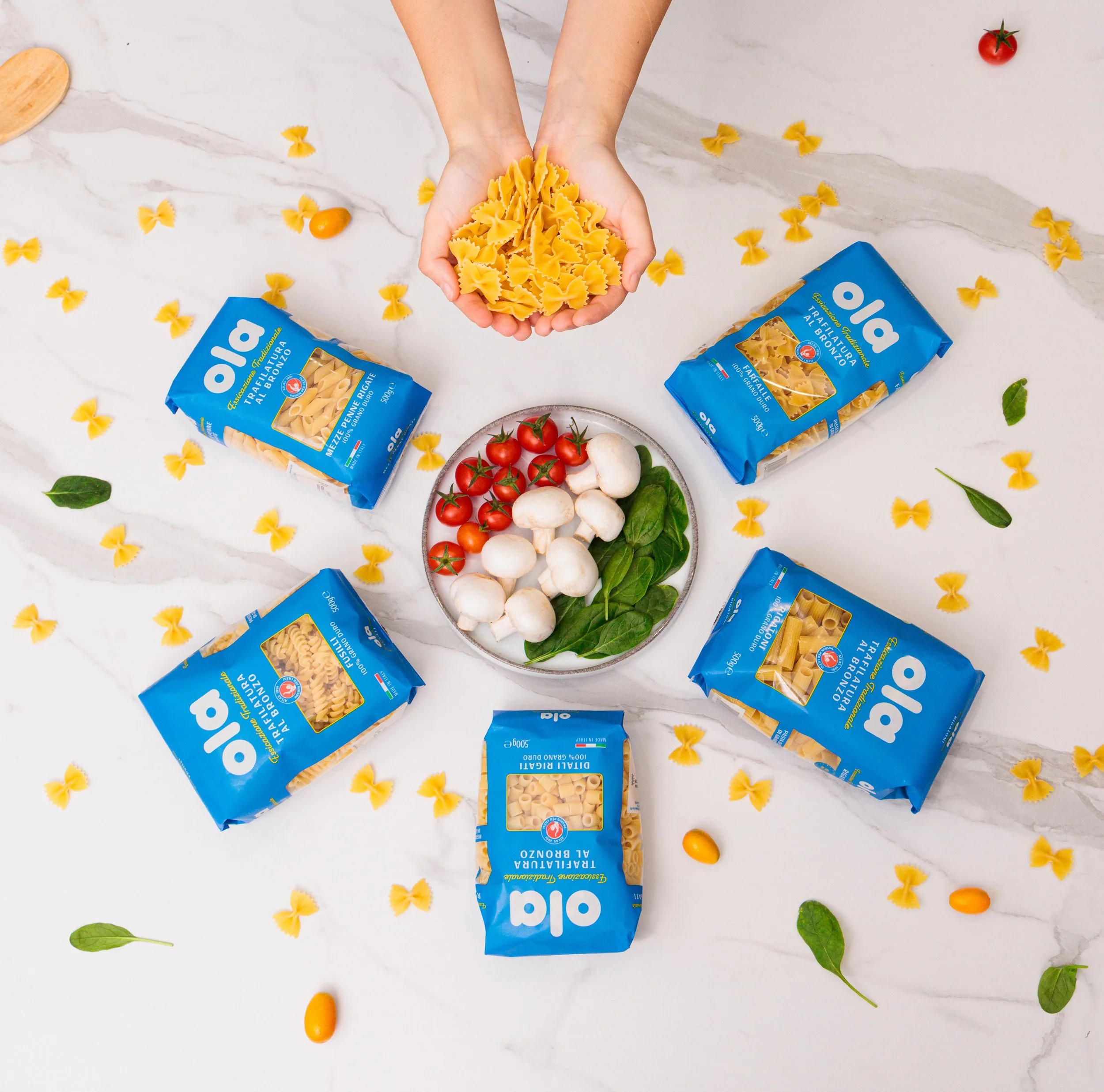
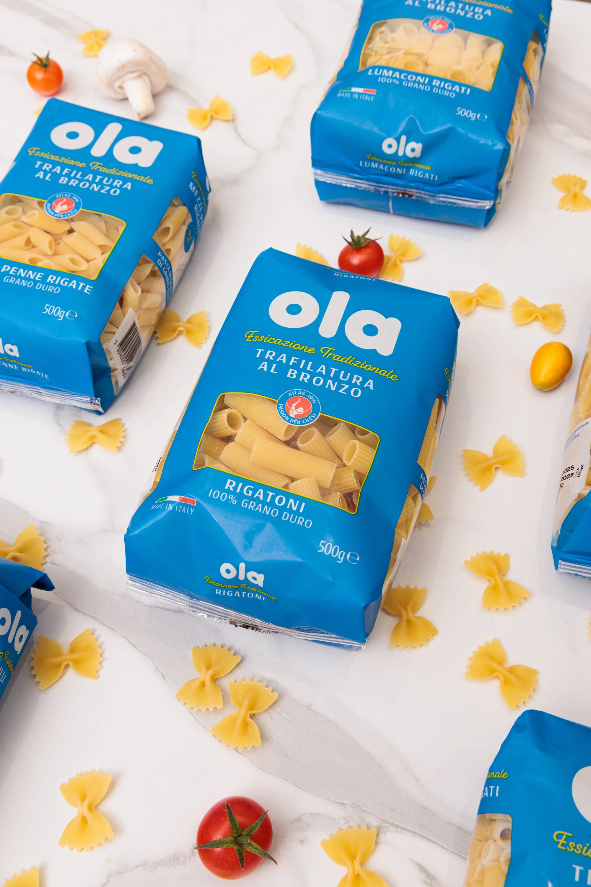
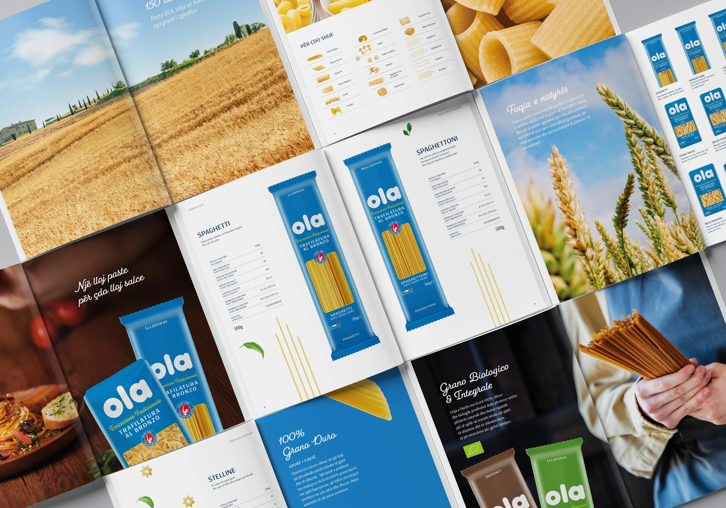
The objective of this project is to design the packaging system for OLA Pasta, ensuring a clear visual connection with the existing OLA flour line, while subtly evolving the design to suit the pasta category.
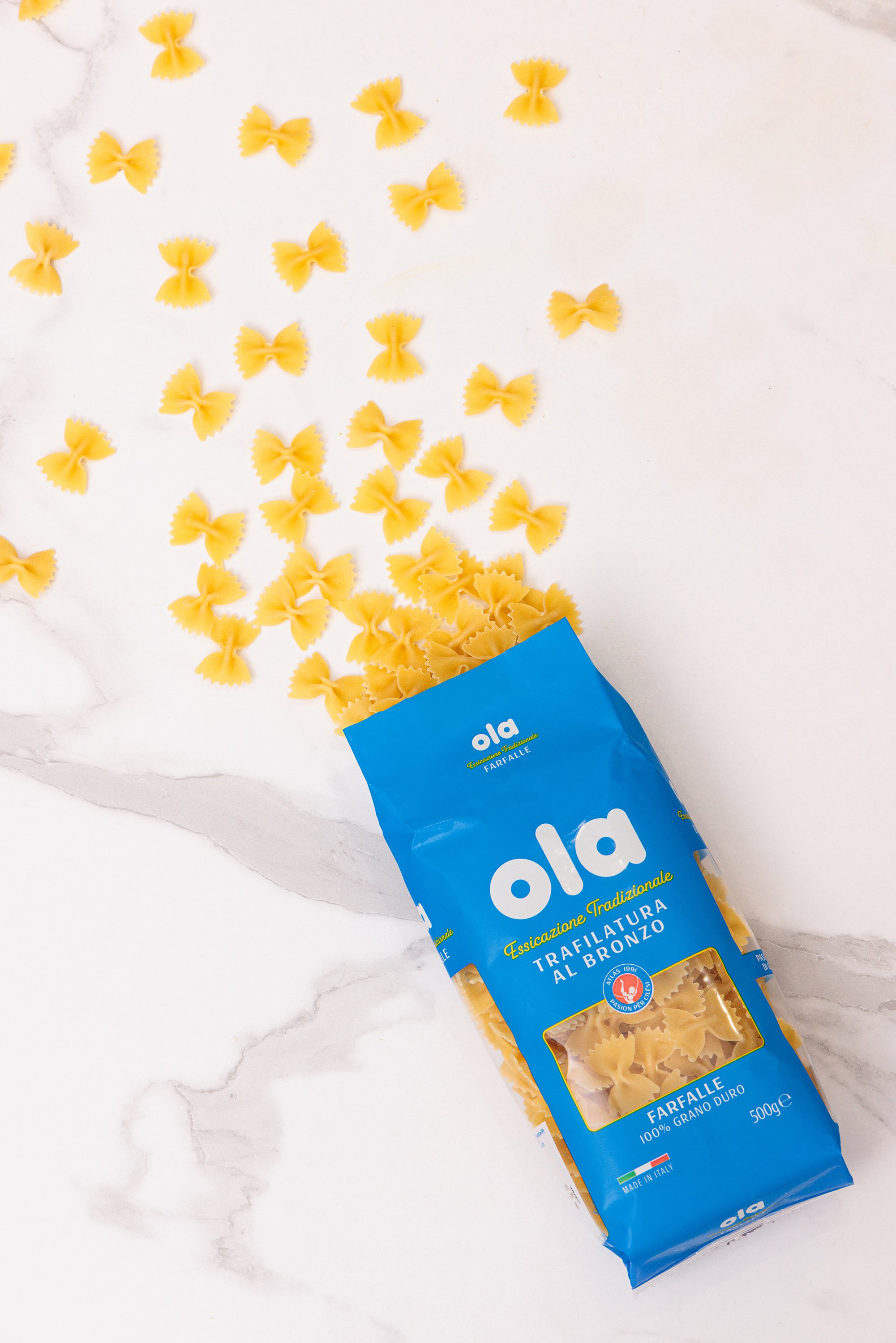
We approached this project with a cleaner and more refined design proposal, while preserving the strength, boldness, and iconic blue color of the OLA brand.
Our goal was to elevate the existing identity through a soft rebranding, creating a more polished and contemporary visual language, while maintaining the brand’s recognizability and authority. This approach was then consistently applied across the full range of OLA pasta packaging.

The blue color played a central role in the design system. It is one of OLA’s strongest visual assets: highly visible from a distance, vibrant, and instantly recognizable on shelf. Its intensity and brightness allow the product to stand out clearly in retail environments, while also acting as a strong differentiating element within the category.

By refining the visual structure, without weakening the brand, we ensured that OLA Pasta feels both familiar and renewed: a natural evolution of the brand, aligned with its heritage, yet clearly positioned for a new product category.
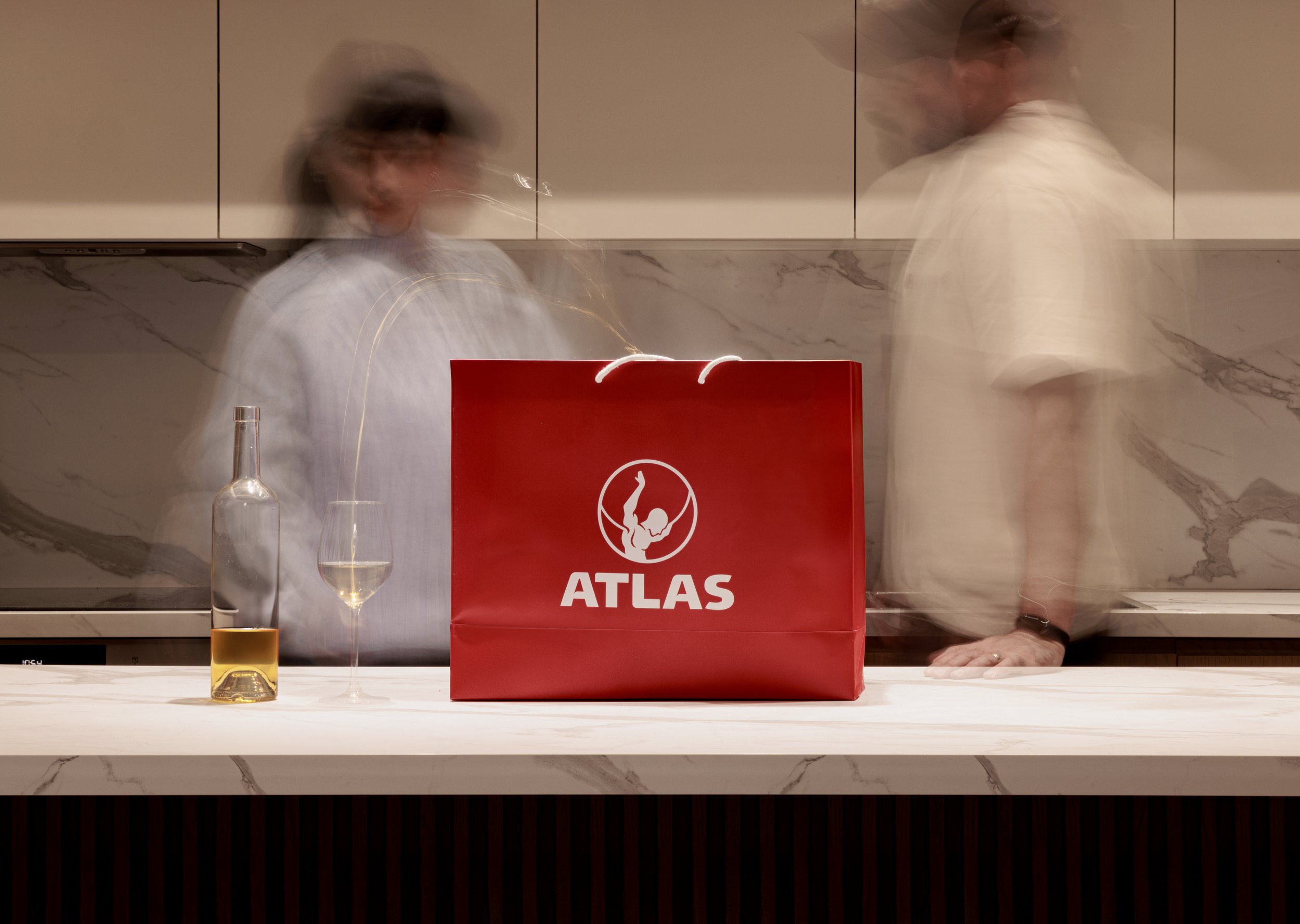
We decided to place the Atlas icon at the center of the packaging, treating it as a quality stamp that guarantees the brand’s expertise, production know-how, and product quality.
Beyond its symbolic value, the icon also plays an important visual role, creating contrast and balance within the packaging design, reinforcing hierarchy and drawing attention to the core brand message.

OLA Pasta is now present in many markets across Albania and has become part of numerous households. Through a successful collaboration and a product we truly believed in, we were able to build a clear, consistent presence and a strong, recognizable identity.

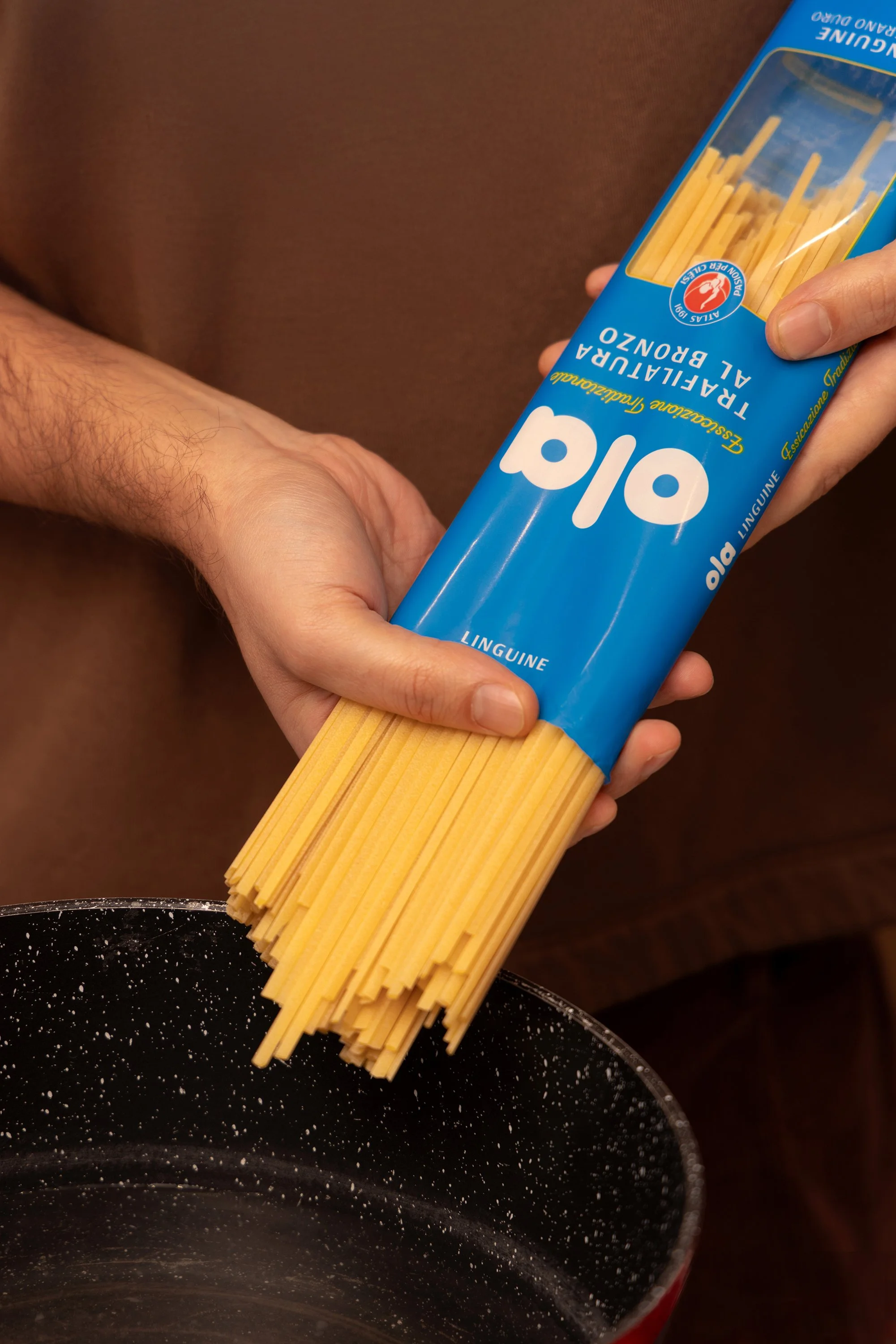
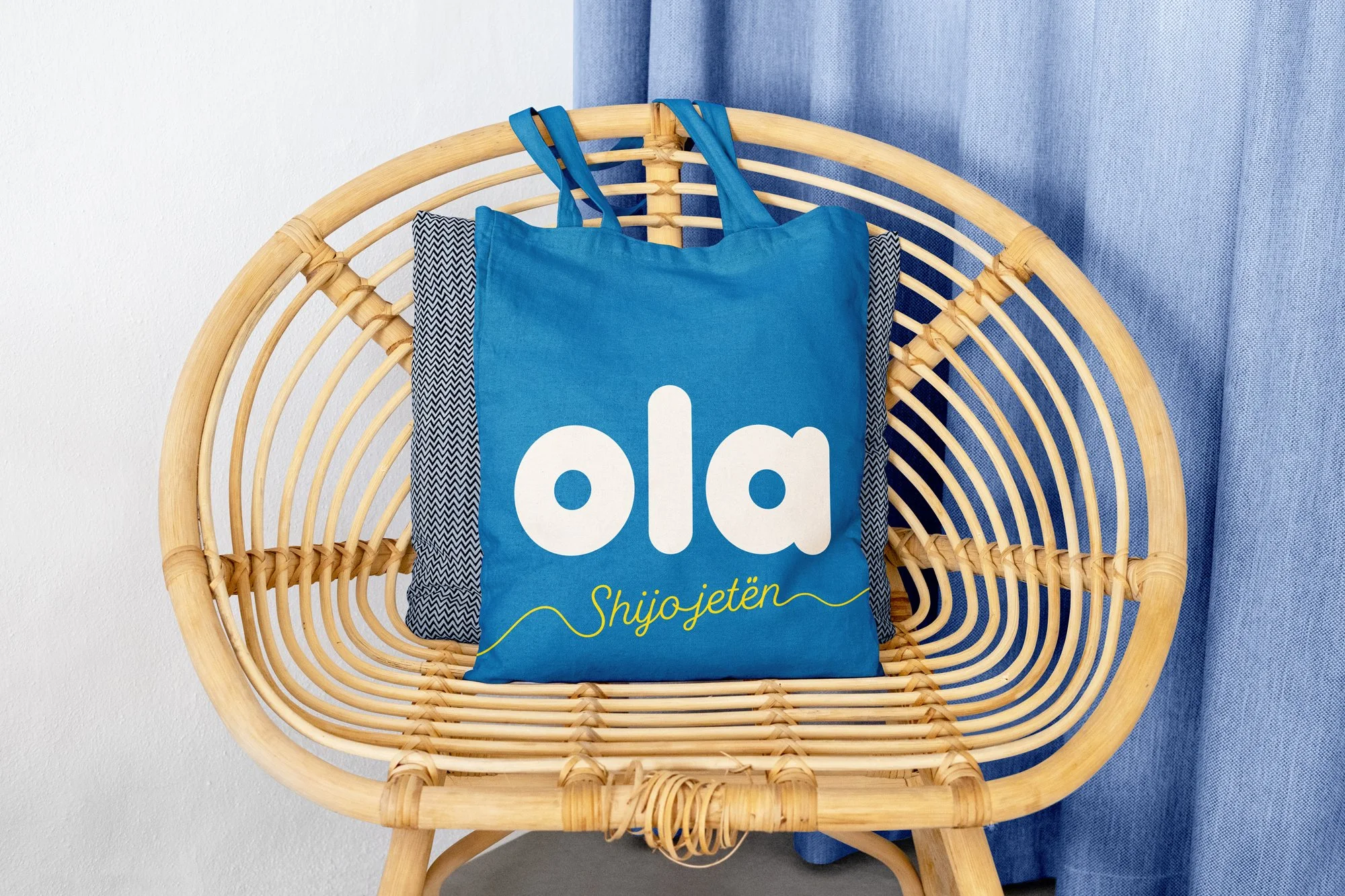
Beyond the packaging, the brand application was extended across multiple touchpoints, while consistently preserving clarity, simplicity, and a clean design language.
To support the brand’s expansion into the B2B market, we developed a comprehensive product catalog that presents the full OLA pasta range, clearly structured by categories and relevant product attributes. The layout integrates the brand’s signature colors and typography, creating a strong visual connection with the packaging and preserving a consistent, recognizable OLA identity throughout.
rusting us with this project was not an easy decision—nor was it a simple task for us. We carried a significant responsibility in working on a product with a strong and widespread presence in the Albanian market. Reaching this final result was a true challenge, as every change, no matter how small, had a substantial impact, not only on production, but also on how the product is perceived by consumers.