POP Bistro
2026
Bistro
Services
→ Brand Identity
→ Strategy
Challenge
Pop needed to be more than a menu of food and drinks. Positioned as a bistro where people could linger over a coffee, a working lunch, or a late-night cocktail, the brand had to feel equally at home across every one of those moments. The task was to give it one identity flexible enough to carry all of them without ever losing its shape.
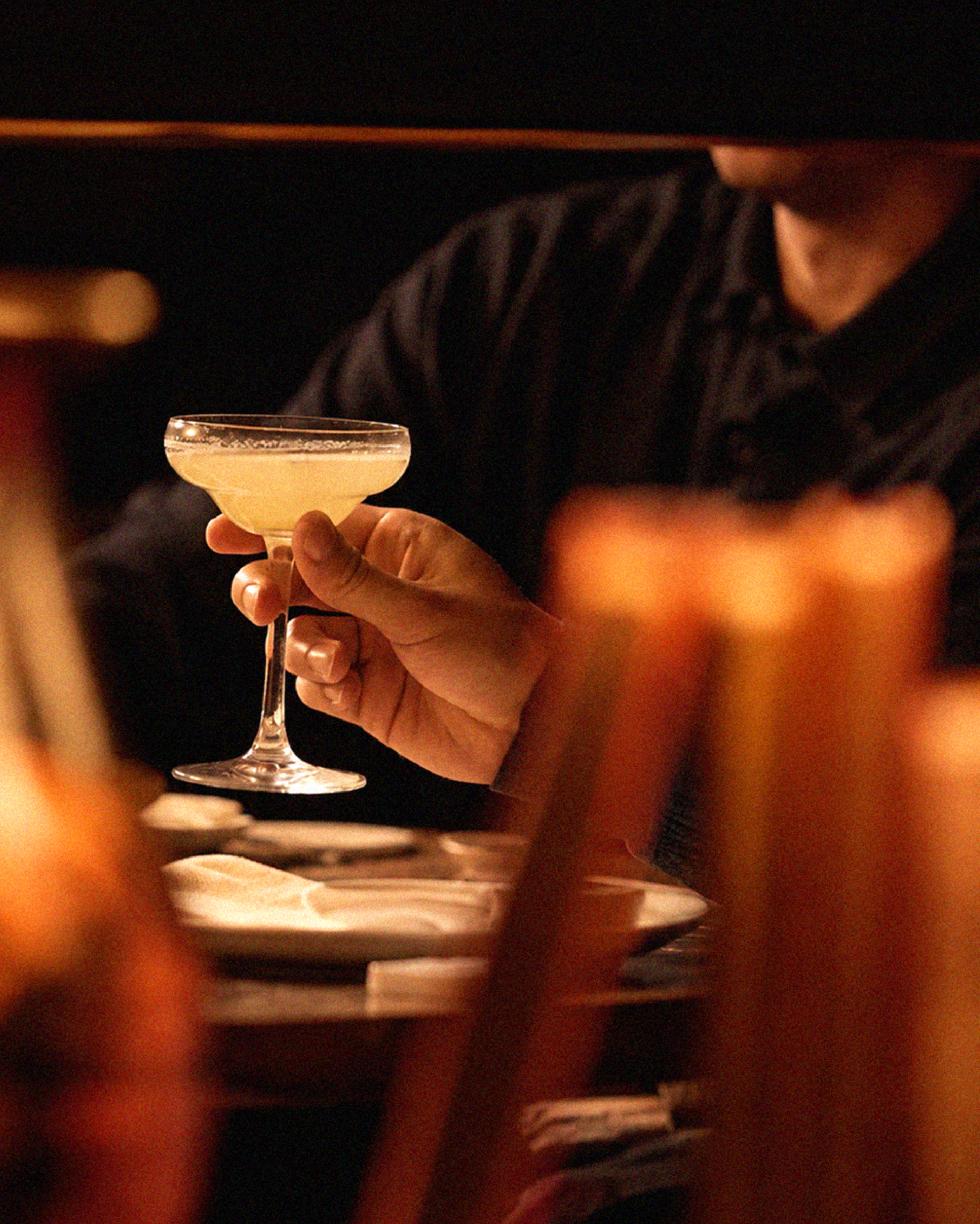
A guest stopping by at eight in the morning and one returning at eight at night needed to recognize the same brand, carrying the same warmth, even though almost nothing else about the visit was the same. The challenge was building a system flexible enough to move through a full day without feeling stretched thin or inconsistent from one moment to the next.


Every decision traced back to a single idea: Pop as a social anchor, a space designed around connection, comfort, and presence, where people return not only for the menu but for the feeling. Rather than building the brand around a cuisine or a category, we built it around that atmosphere itself.
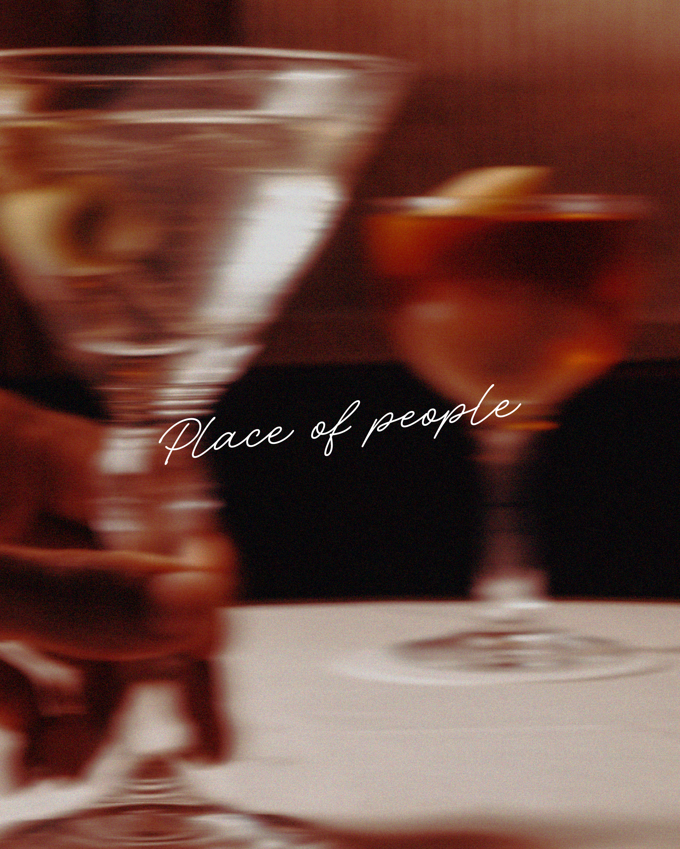
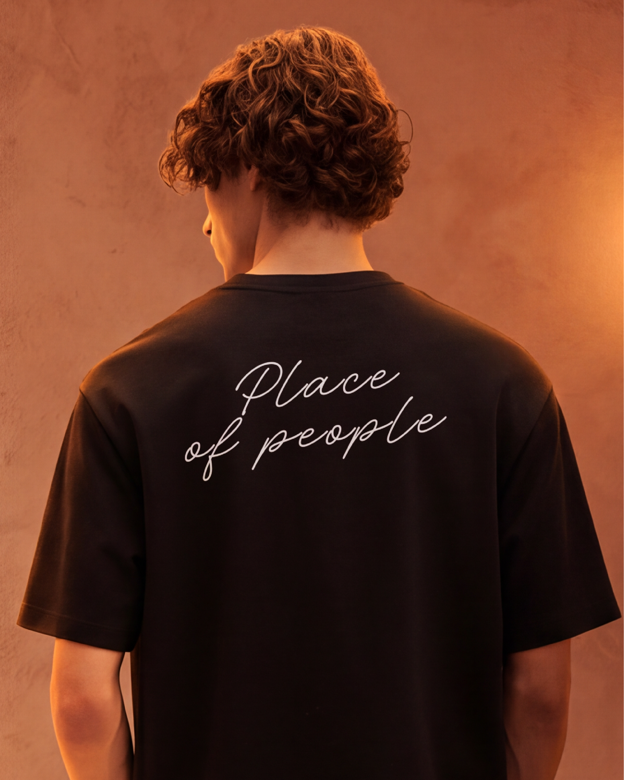
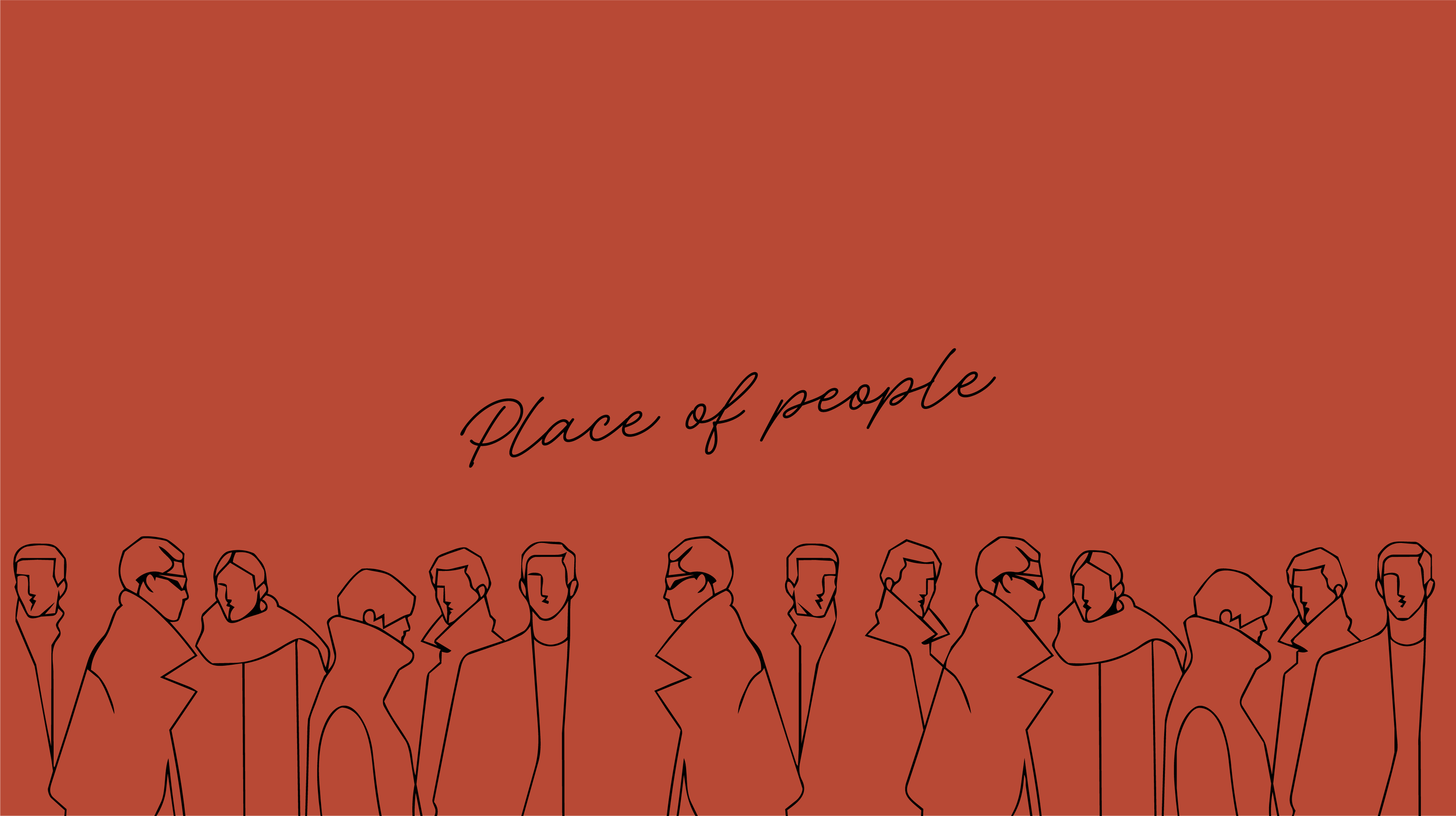
That principle became the brand's signature line, "Place of People," showing up not as an afterthought but as the idea the whole system was built around from the start. It appears quietly across every touchpoint that followed, never louder than the moment it's supporting.
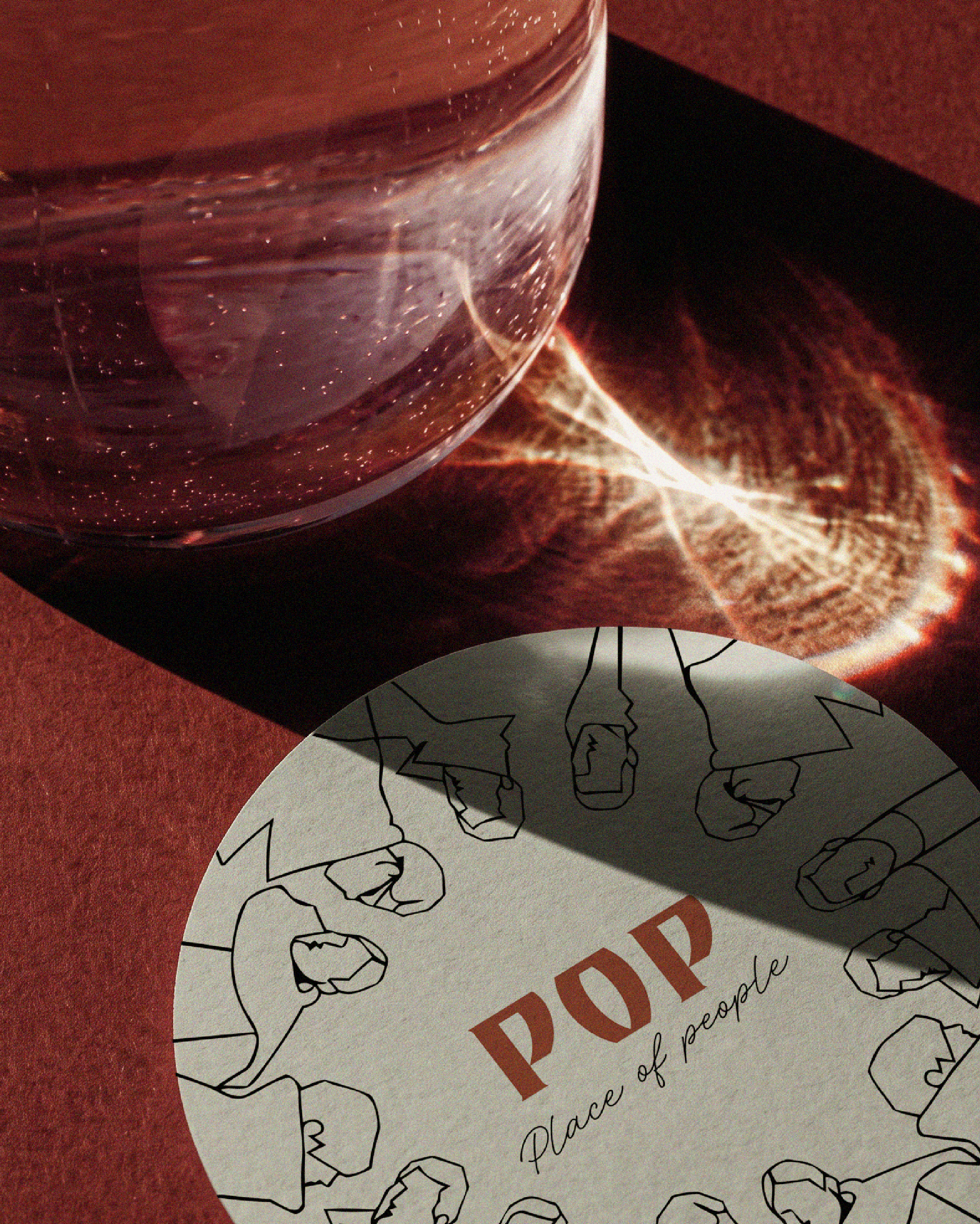
The thinking shaped a bold, hand-cut wordmark, confident enough to anchor a storefront sign and hold its own at a distance, paired with a soft cursive signature carrying the "Place of People" line underneath. Together the two form a single, complete signature.
One mark leads and commands attention, the other softens and invites closeness. Together they let the brand shift in tone depending on where it appears, structural on a sign, personal on a menu or a cup, without either one ever overpowering the other or breaking the system.
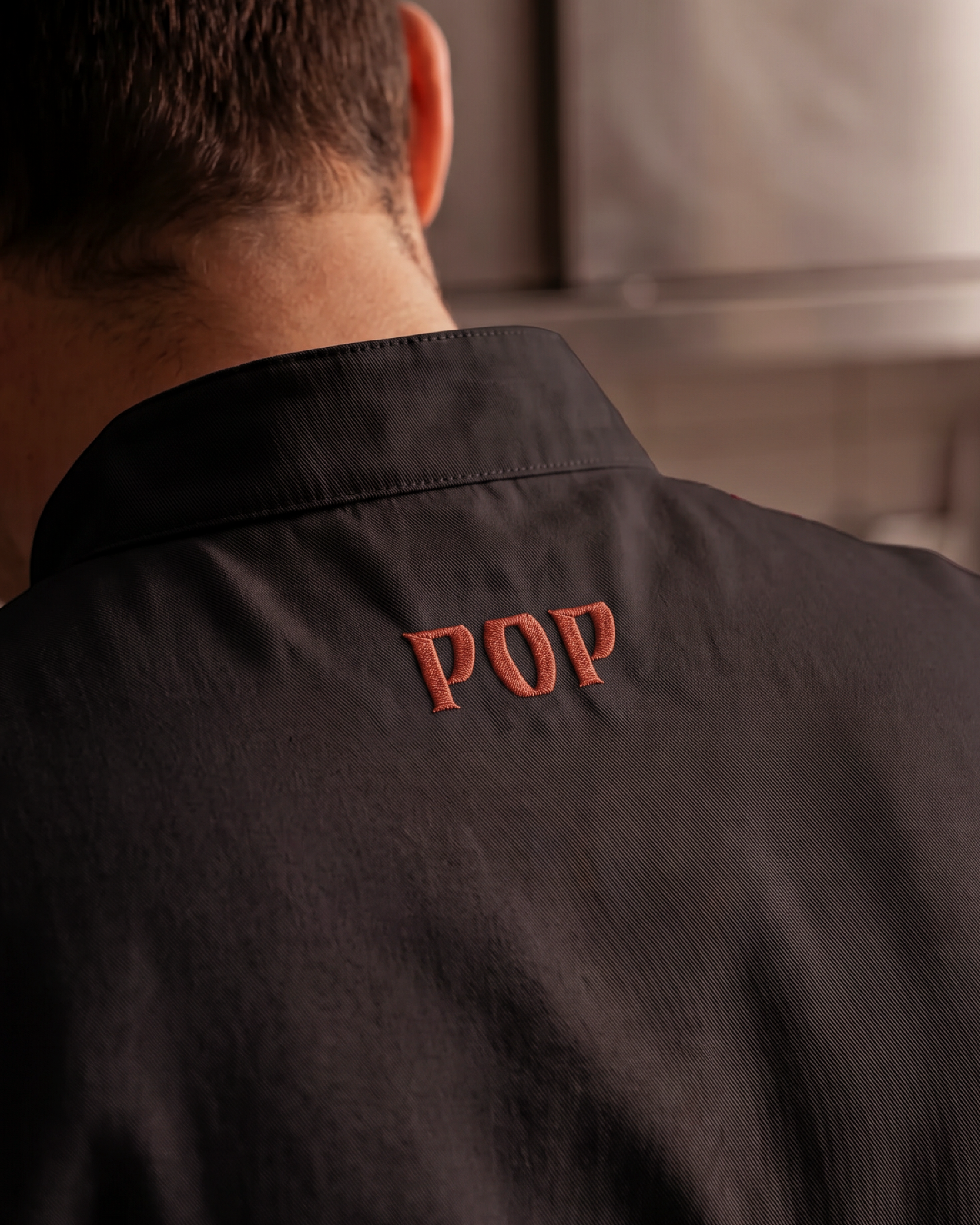
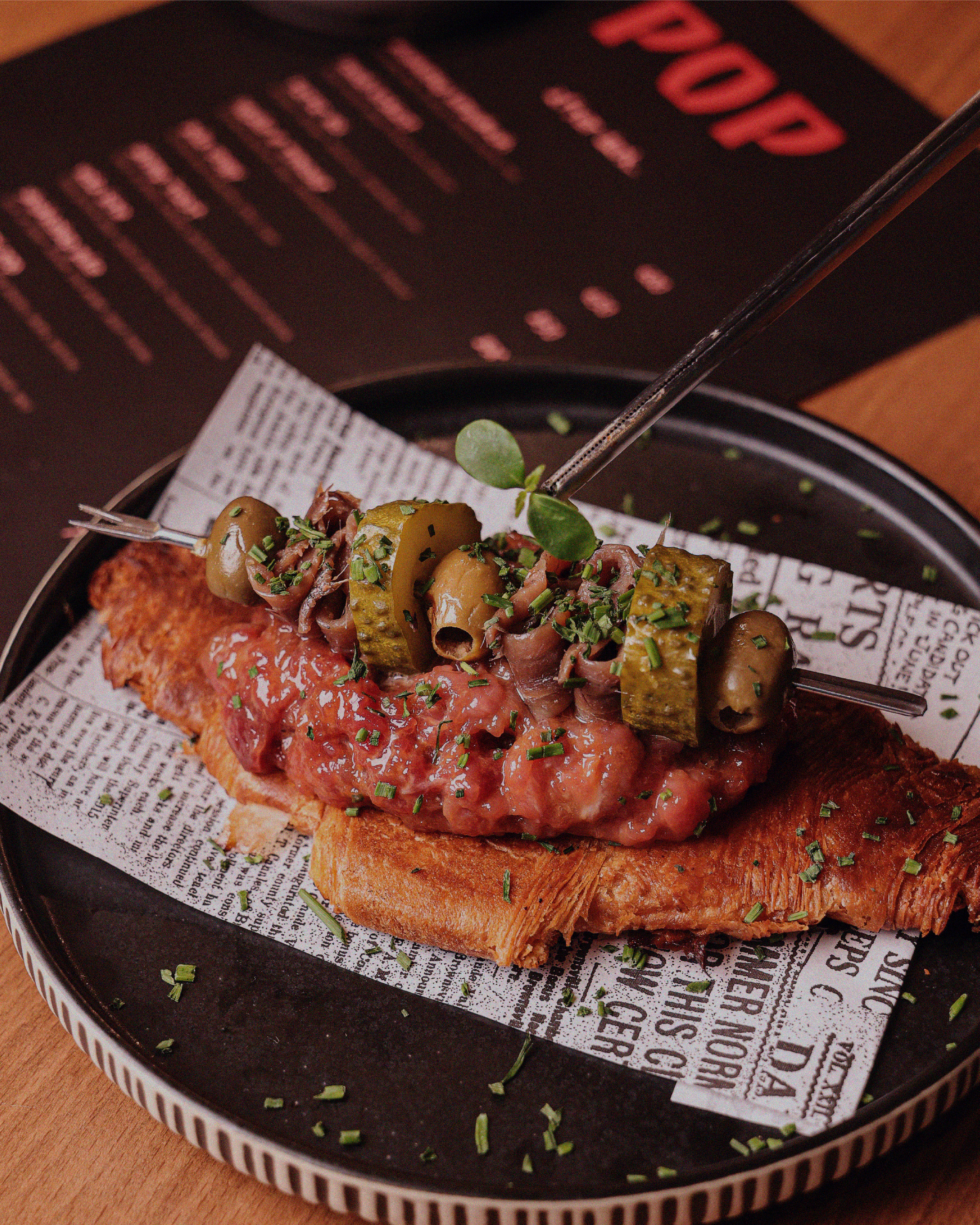
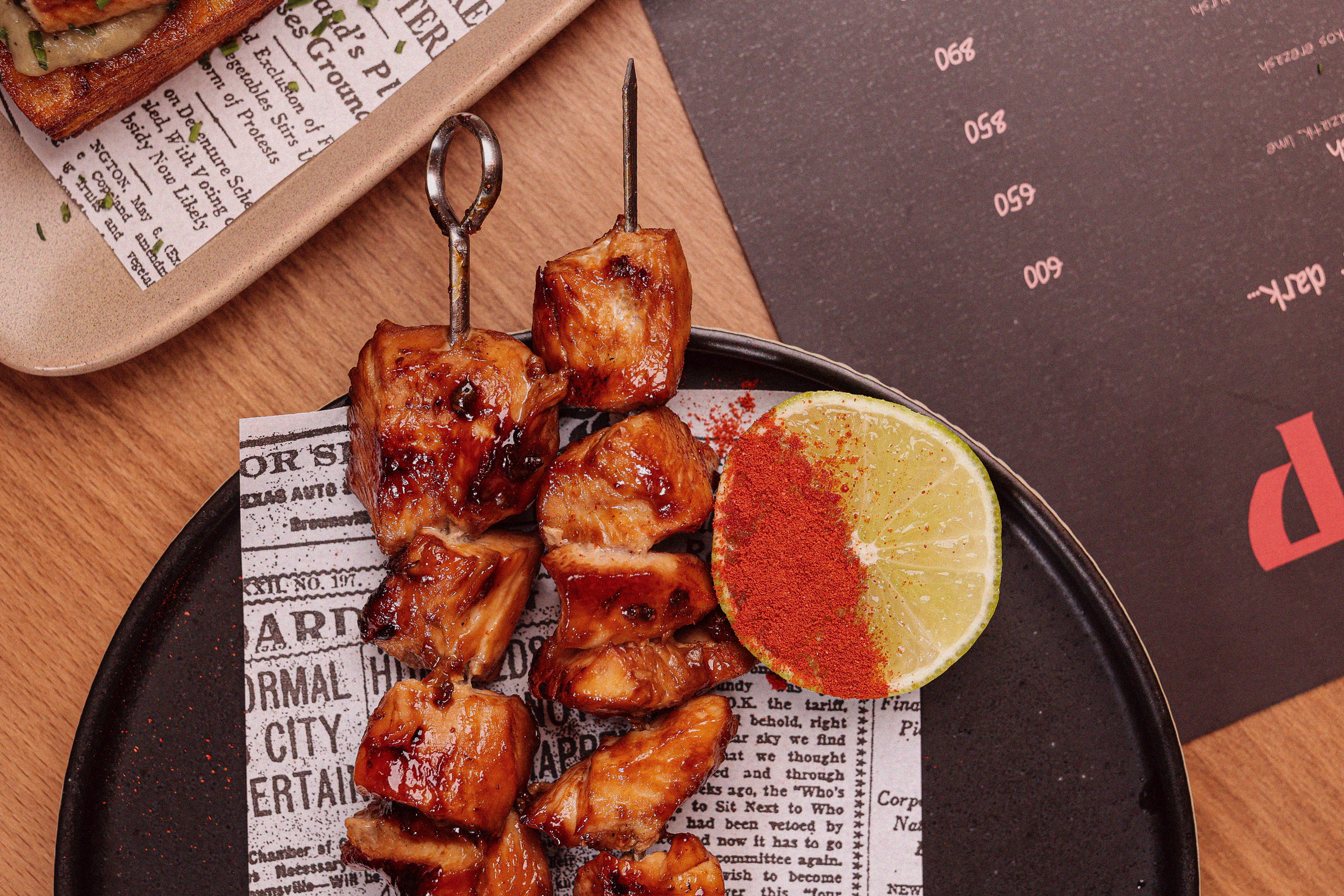
The color and material language followed the same logic as the concept itself: warm, textural, and unhurried. It was built to keep the brand close to the food and the room it lives in, supporting the experience rather than competing with it.
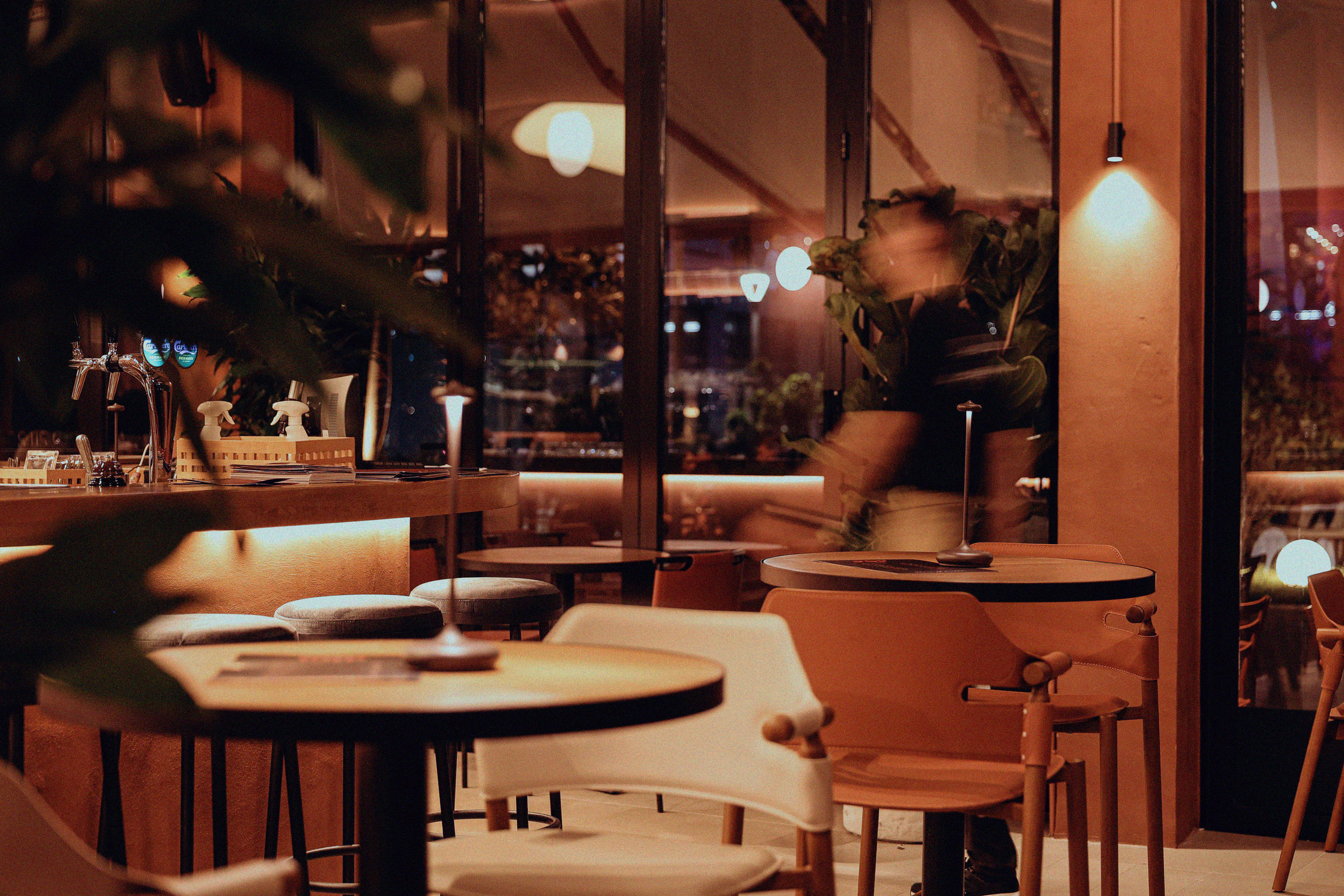
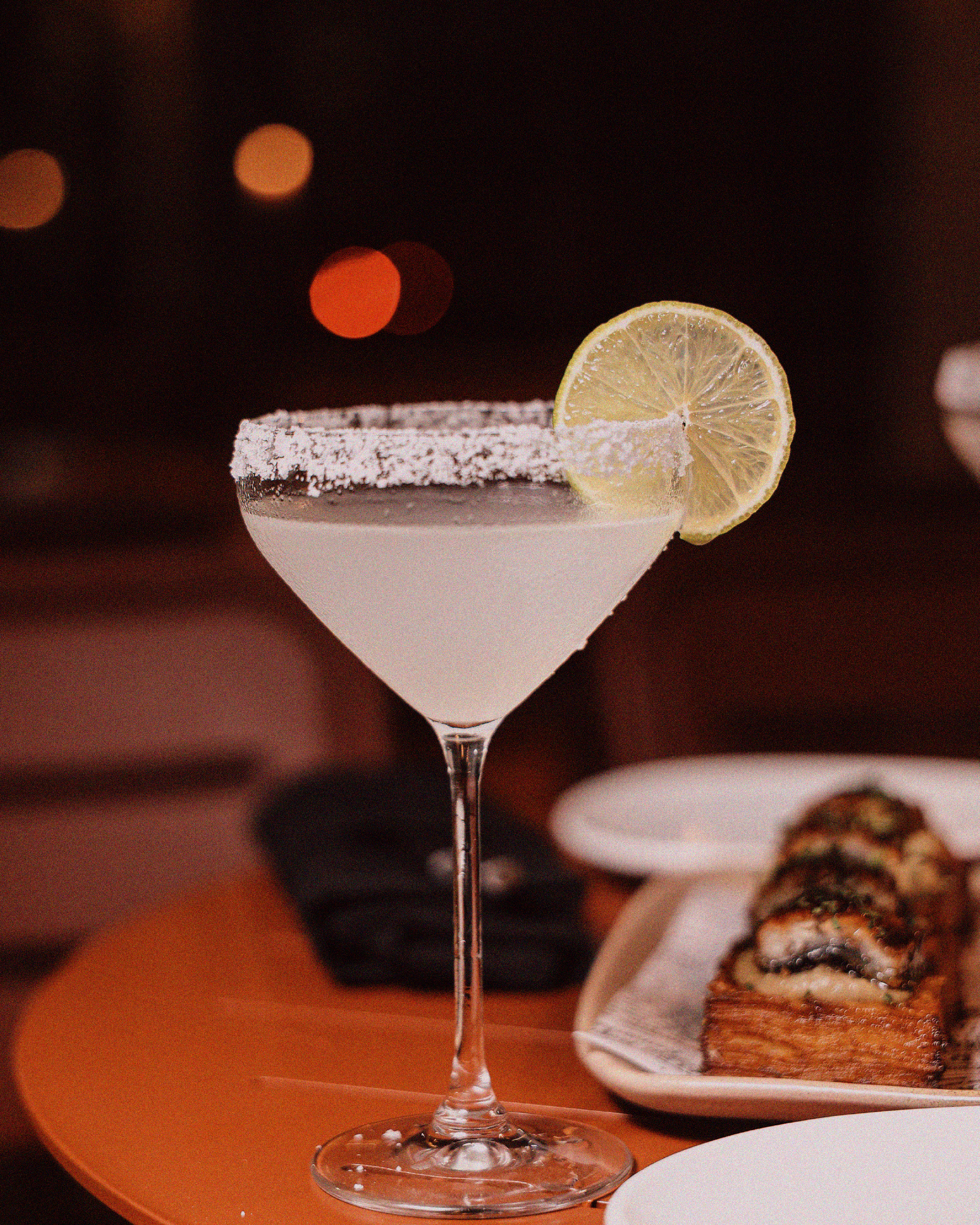
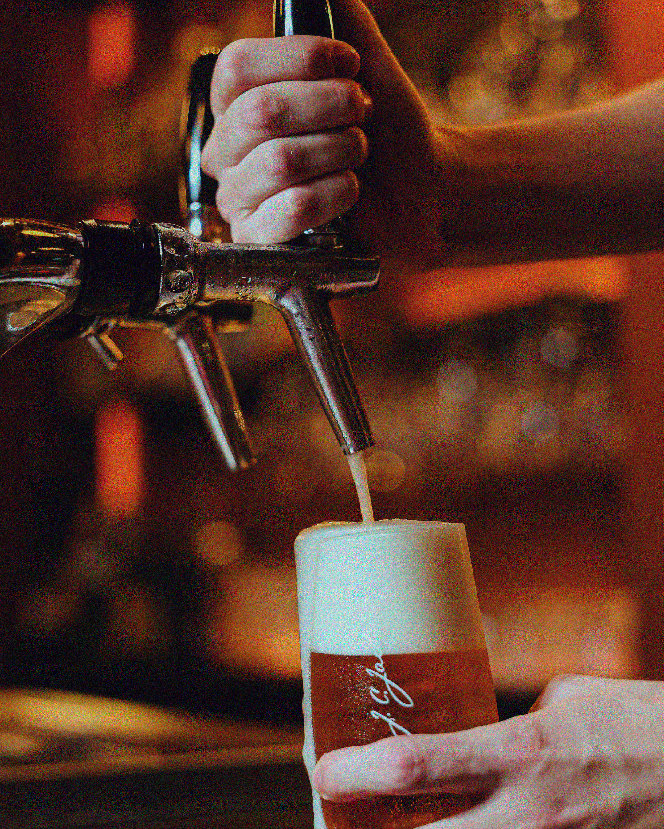
Photography and material choices leaned into raw plaster, wood, stone, and greenery rather than polished, styled interiors. Every reference was chosen to reinforce the same sense of ease found in the space itself, nothing overly staged or precious.
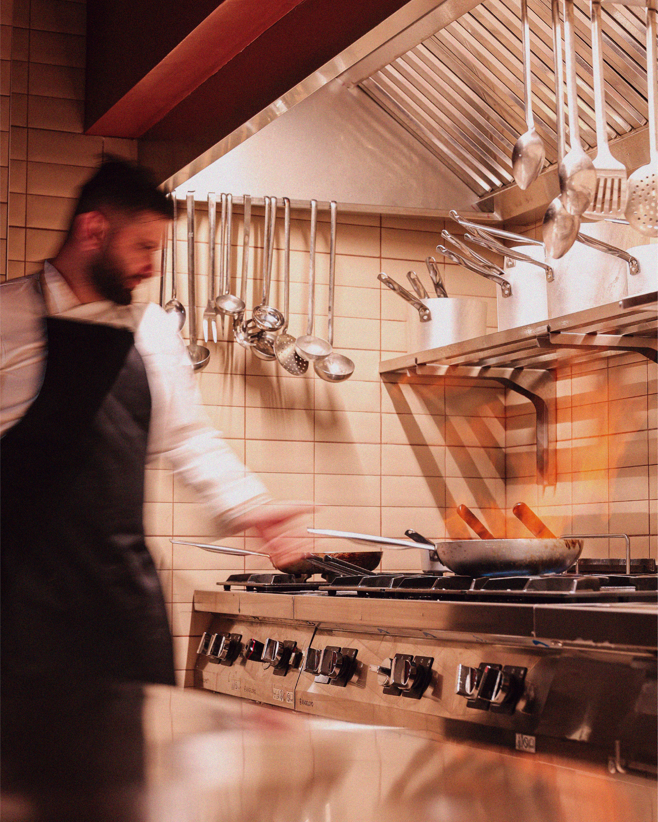
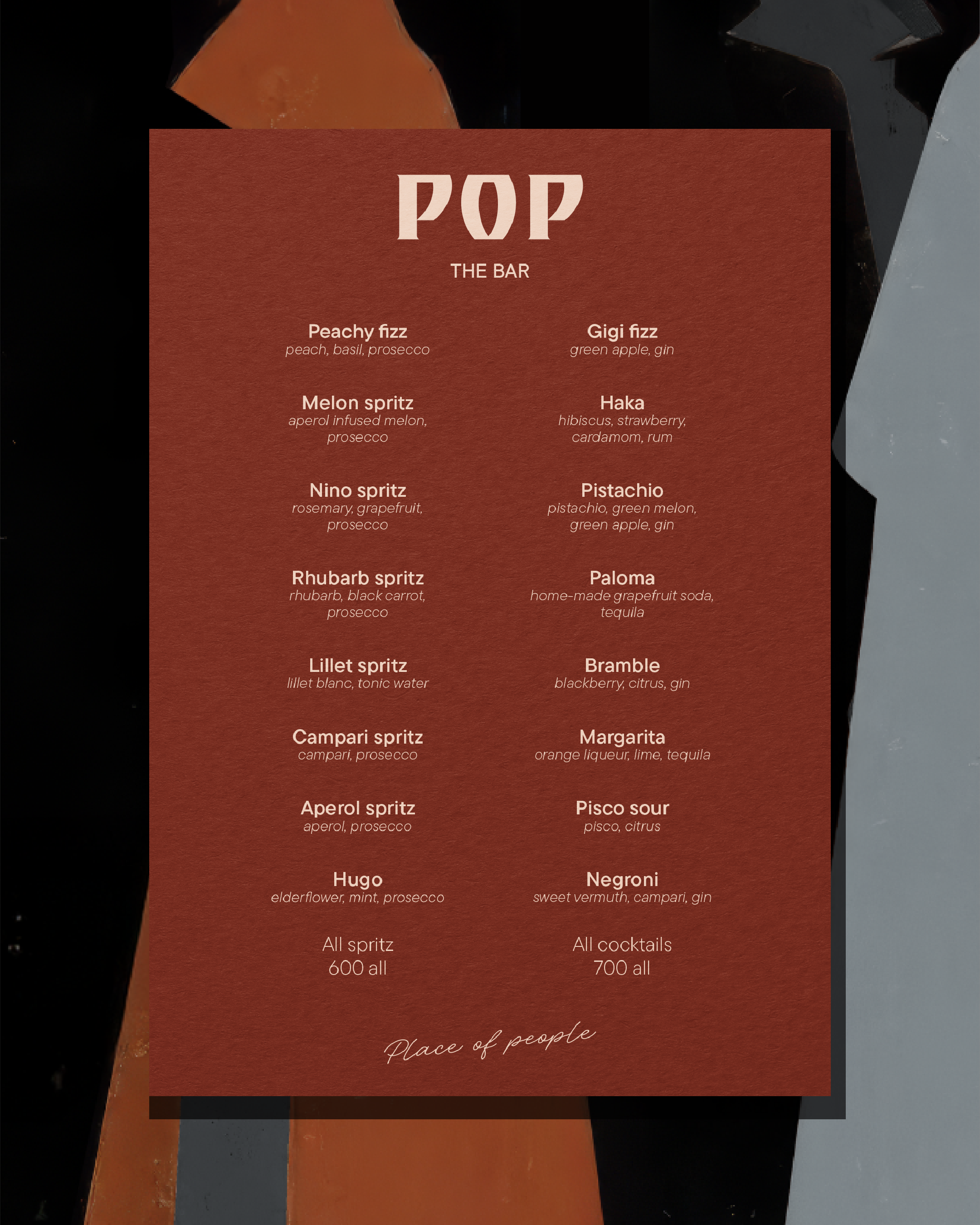
From aprons and staff uniforms to to-go cups, carriers, wraps, and bags, each application carried the same wordmark and tone, adjusted for context rather than redesigned for it. The goal was for the brand to feel considered even in the smallest, most disposable moments.
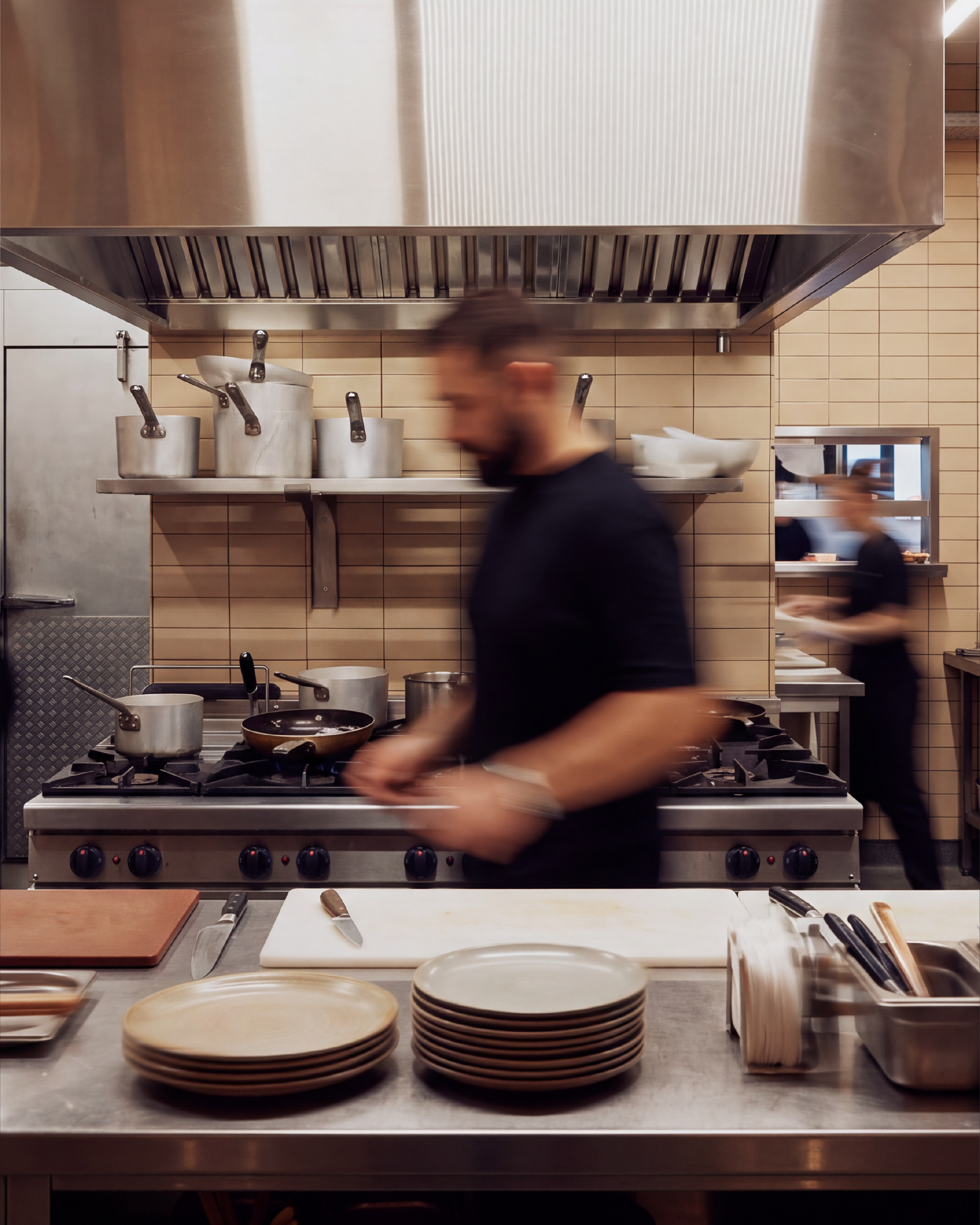
What emerged is a brand that reads less like a restaurant identity and more like a shared experience, consistent whether it's on a coffee cup in someone's hand or a sign above the door. The system gives Pop room to grow without ever needing to be reinvented, reinforcing it as a place that belongs to the people it serves.