Concord Group
2026
Investment Group
Services
→ Strategy
→ Brand System
→ Brand Identity
→ Catalogue
Challenge
Concord Group operates across real estate, hospitality, and infrastructure, working through a growing portfolio of partner brands rather than a single storefront. Every project it touches, from a beachfront resort to a residential tower to a hotel partnership, carries its own name, its own audience, and its own visual world. The challenge was not designing one identity. It was designing a system that could hold a portfolio of businesses together under one name, without flattening what makes each of them different.
The group's model is built on alignment rather than control. Concord works alongside its partners, not above them, which meant the identity had to carry authority without distance. A brand that could lead when it needed to and step back when it needed to, shifting weight depending on the relationship, while always staying unmistakably Concord.
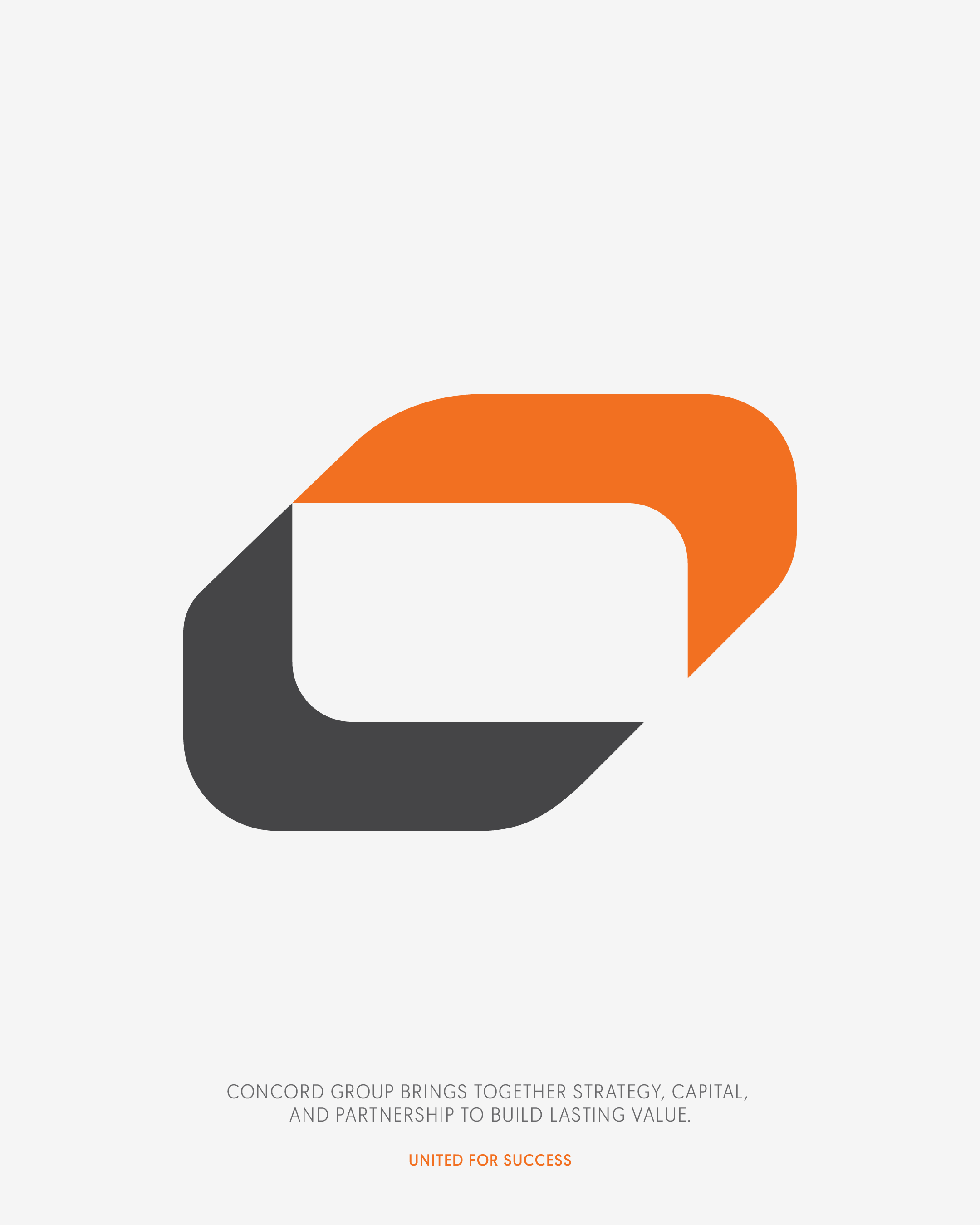

That thinking shaped the mark itself. Two interlocking forms, connected and directional, built to represent partnership rather than hierarchy, flexible enough to lead, sit equal, or quietly support depending on where and with whom it appears.

"United for Success" became the idea running underneath everything, not a slogan added at the end, but the principle the whole system was built around. Every touchpoint had to reflect the same logic: structure that holds, and room for others to stand beside it.
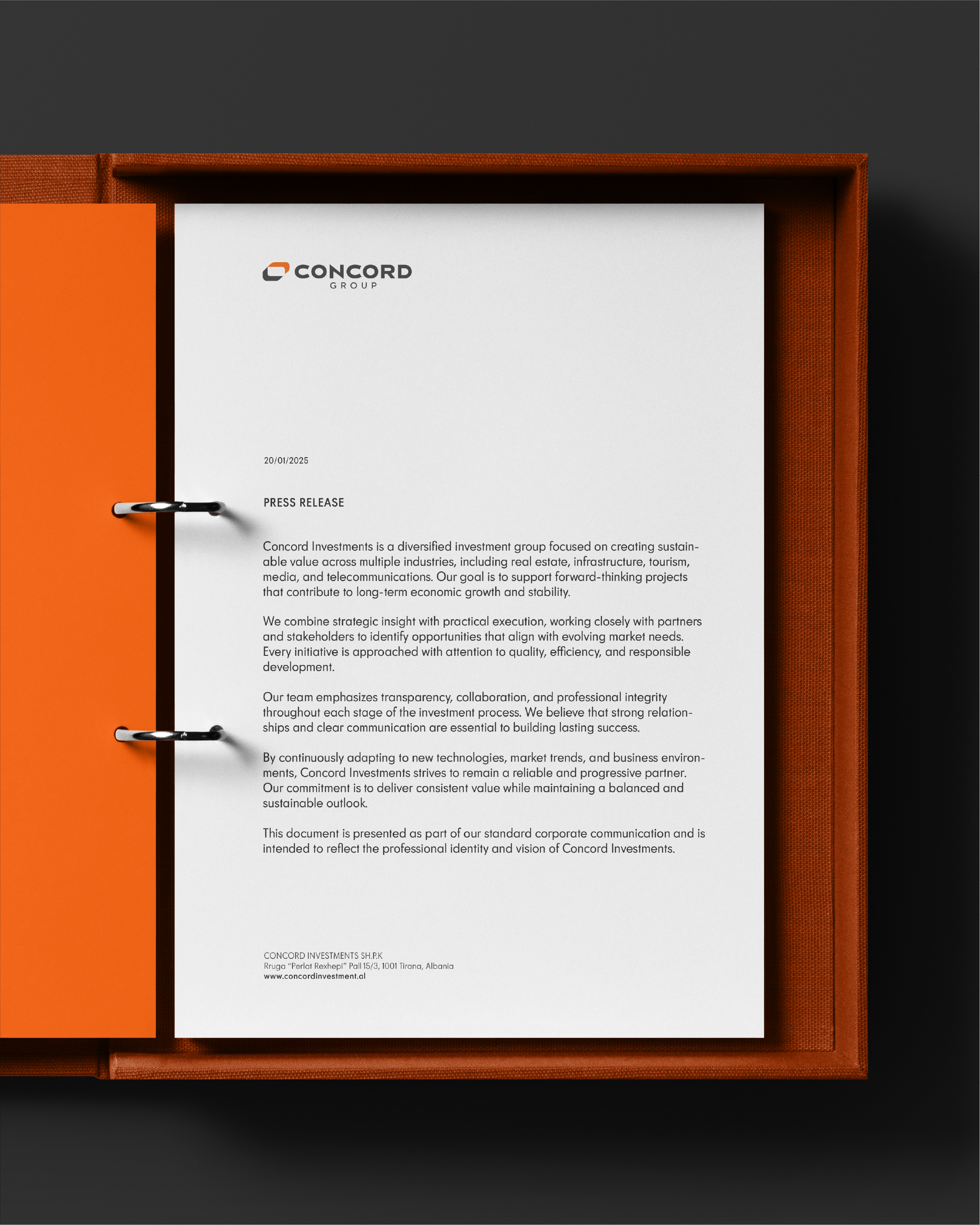
Because Concord's role changes from one relationship to the next, the identity had to be built with rules rather than fixed compositions. Equal presence, lead position, grouped partnerships, and quiet endorsement all needed clear, repeatable logic, so that whoever applies the brand next arrives at the same result without guesswork.
In a market where investment groups often present themselves as distant and transactional, Concord needed the opposite. A presence that felt close, structured, and dependable, communicating stability without ever feeling rigid or corporate for its own sake. The brand needed to be recognized instantly, but never so loud that it competed with the businesses it stands behind.

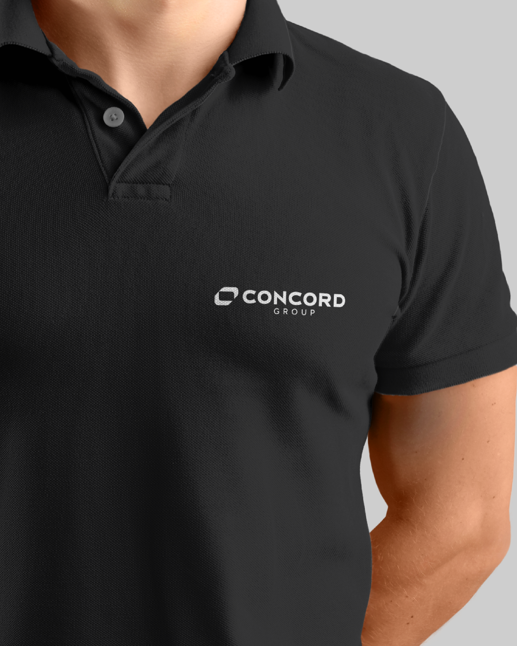
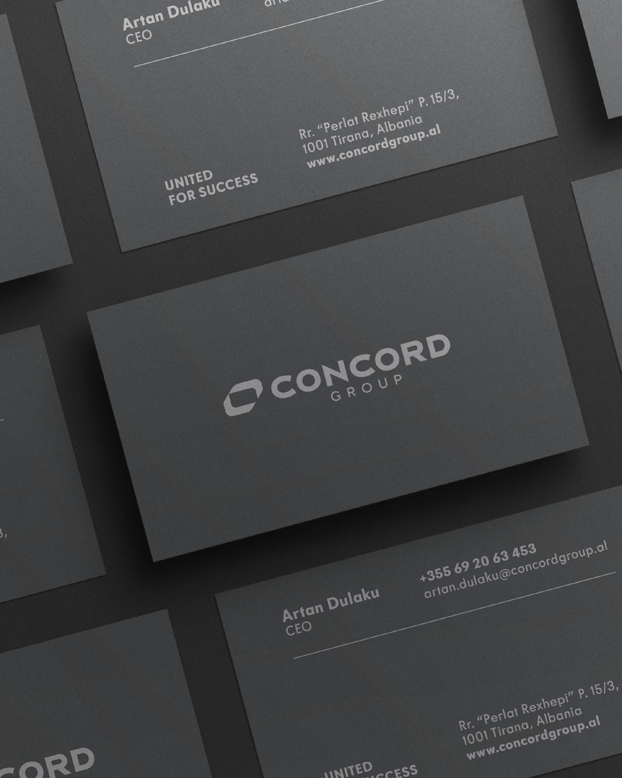
That flexibility extended into how the brand moves across formats, from printed materials to large-scale events, always carrying the same visual discipline, adjusted for context rather than reinvented for it. A rollup banner, a business card, and an event backdrop all needed to be read as the same brand at a glance, even when the content around them changes completely.
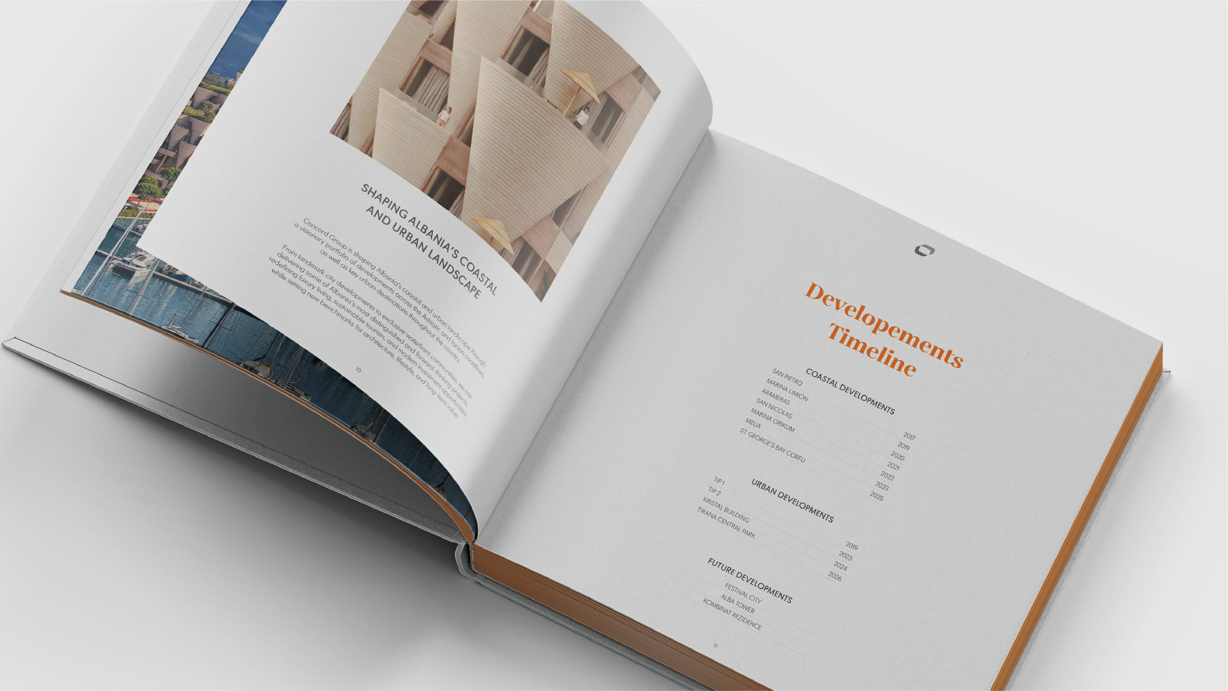
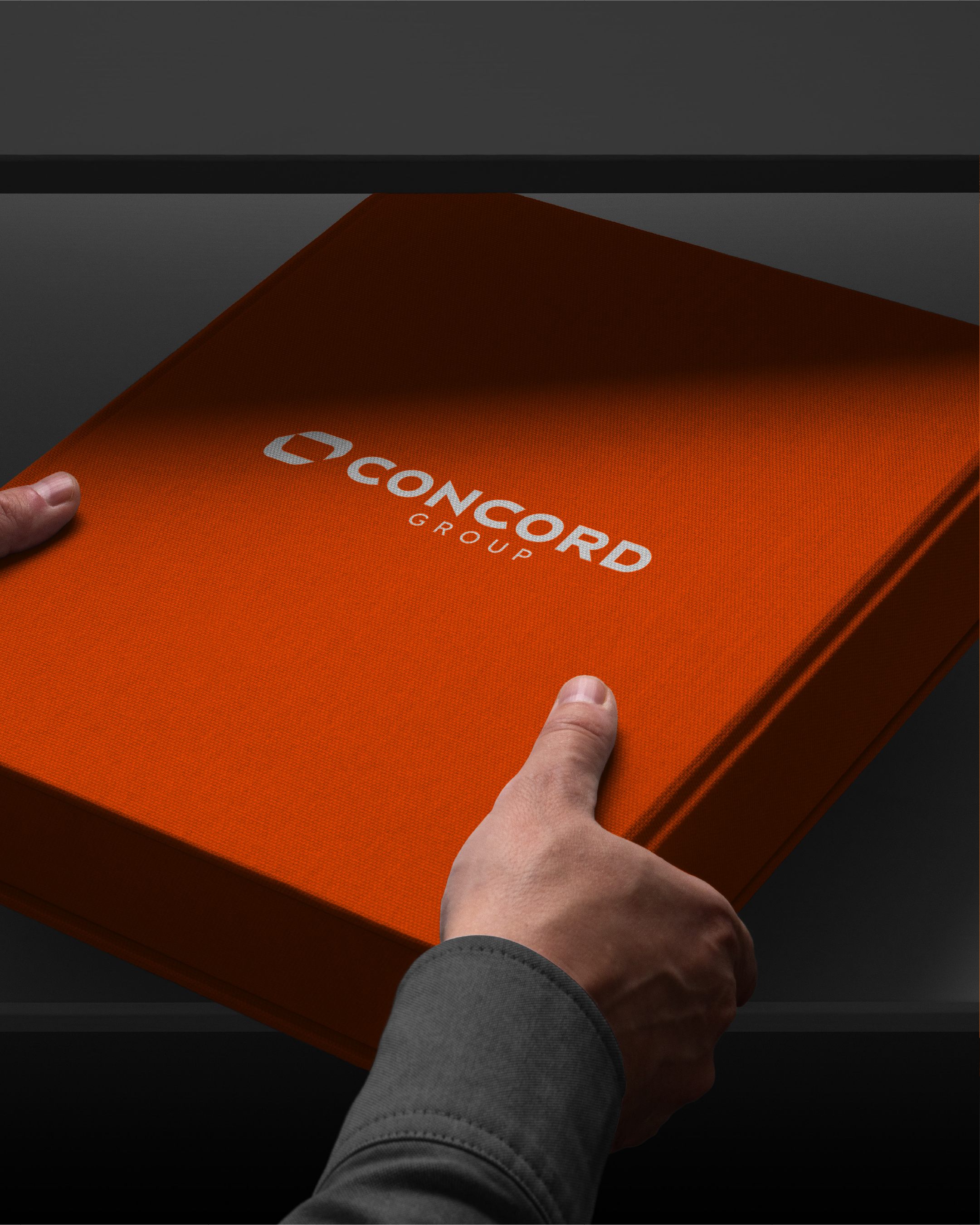
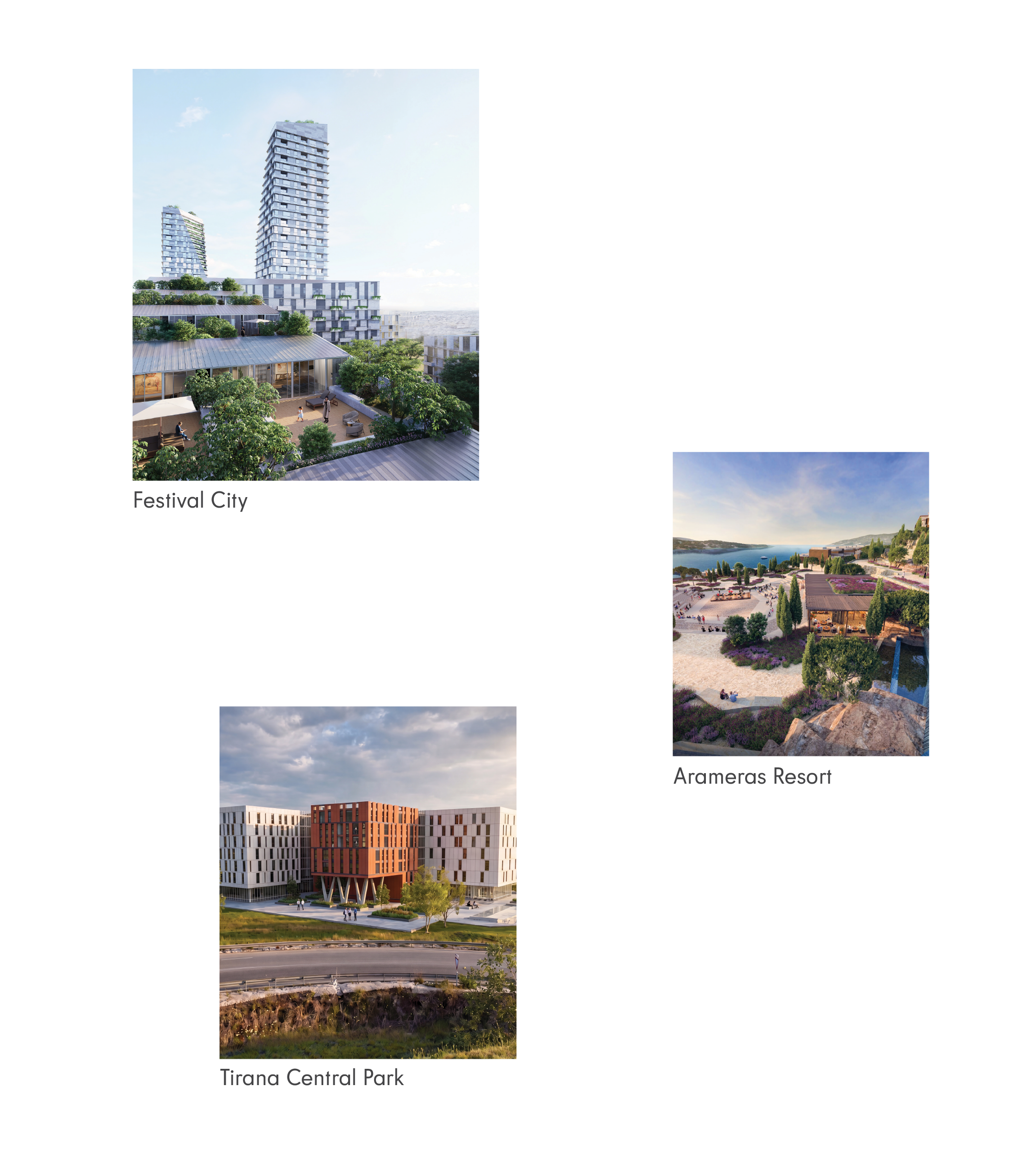
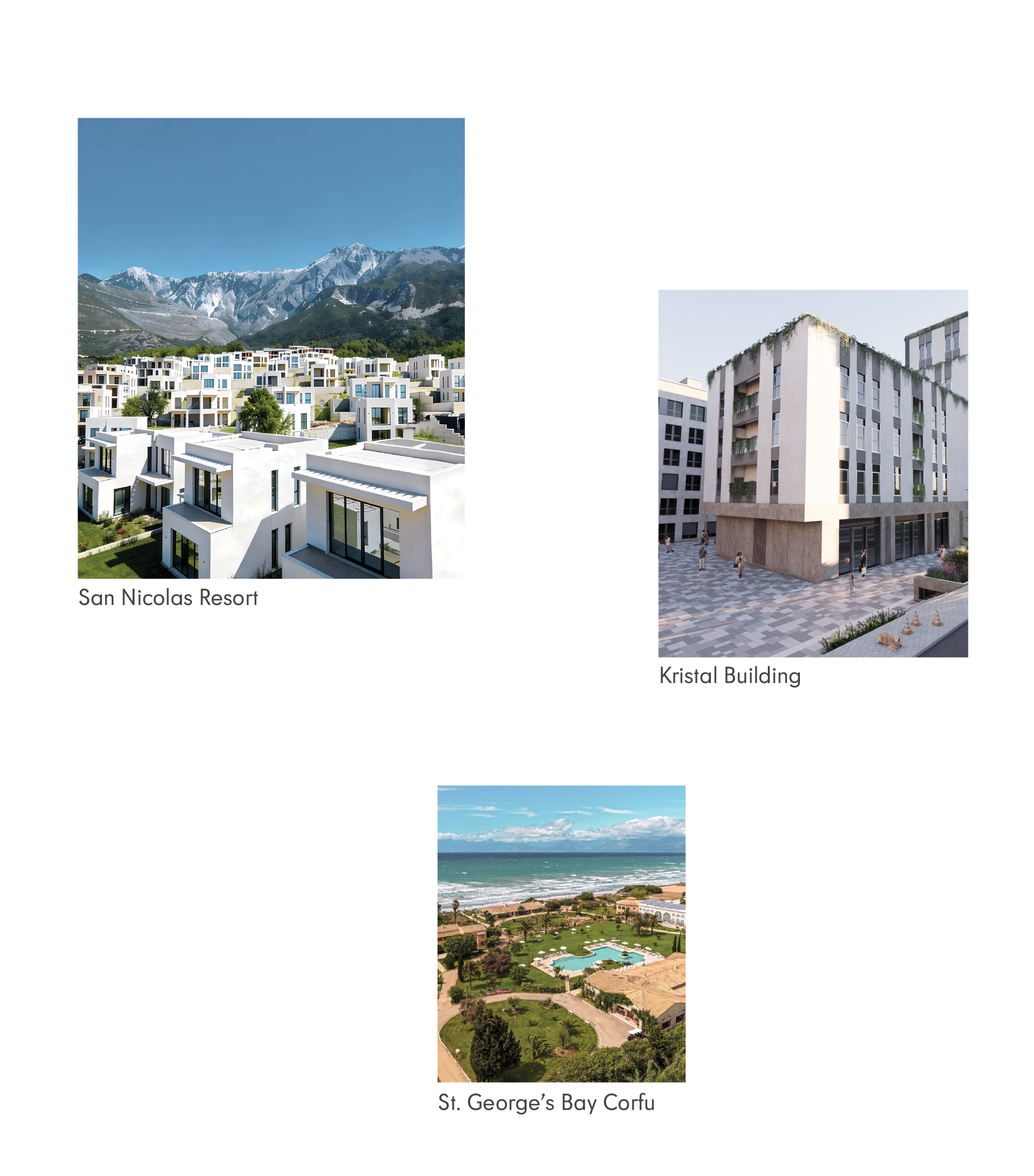
With a portfolio spanning real estate, hospitality, and industrial projects across Albania and abroad, Concord needed a single document capable of presenting all of it with the same clarity and weight. The catalogue became that reference point, a structured index of over two dozen projects, each given its own spread and display title, built to introduce the scale of the group at a glance.
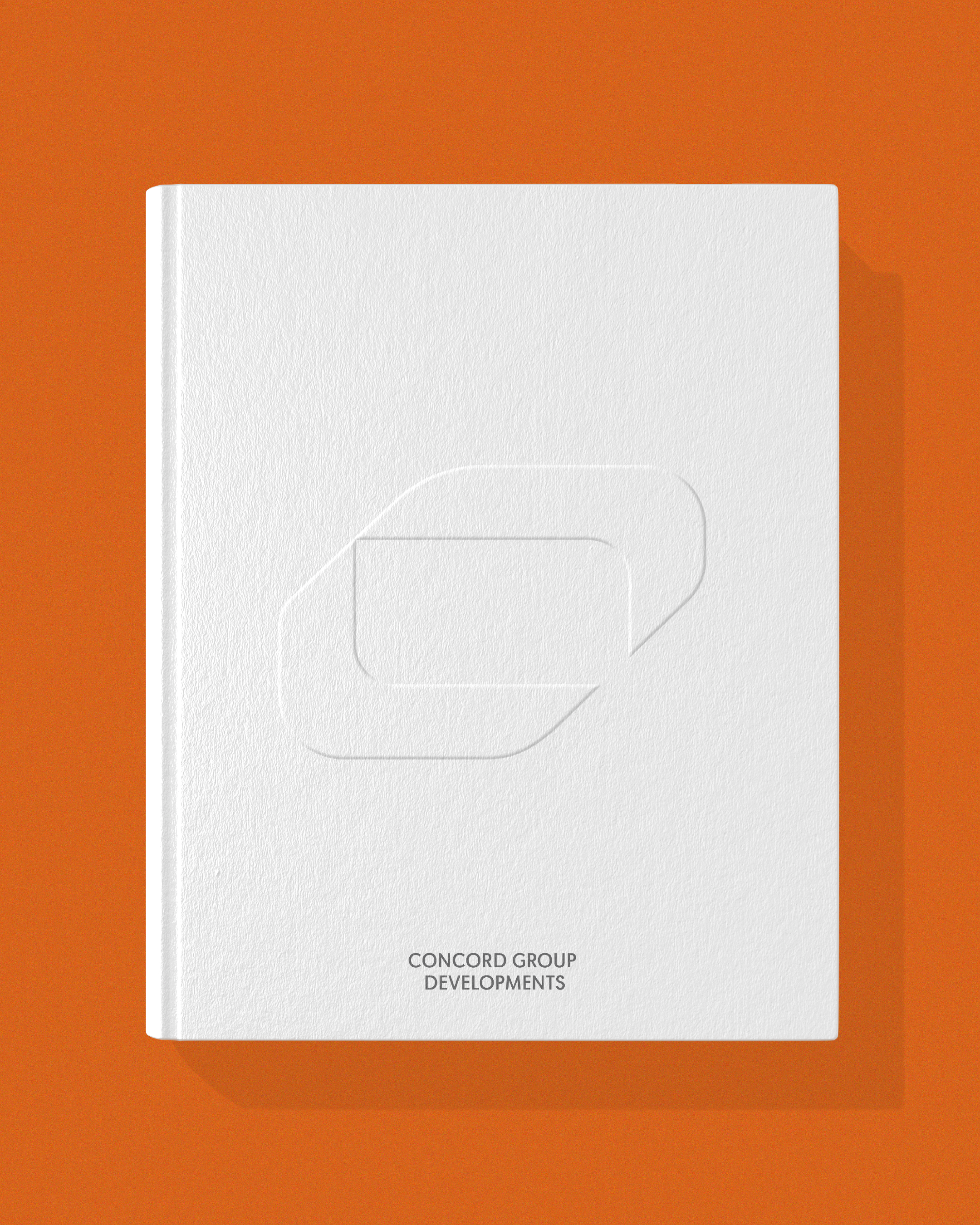
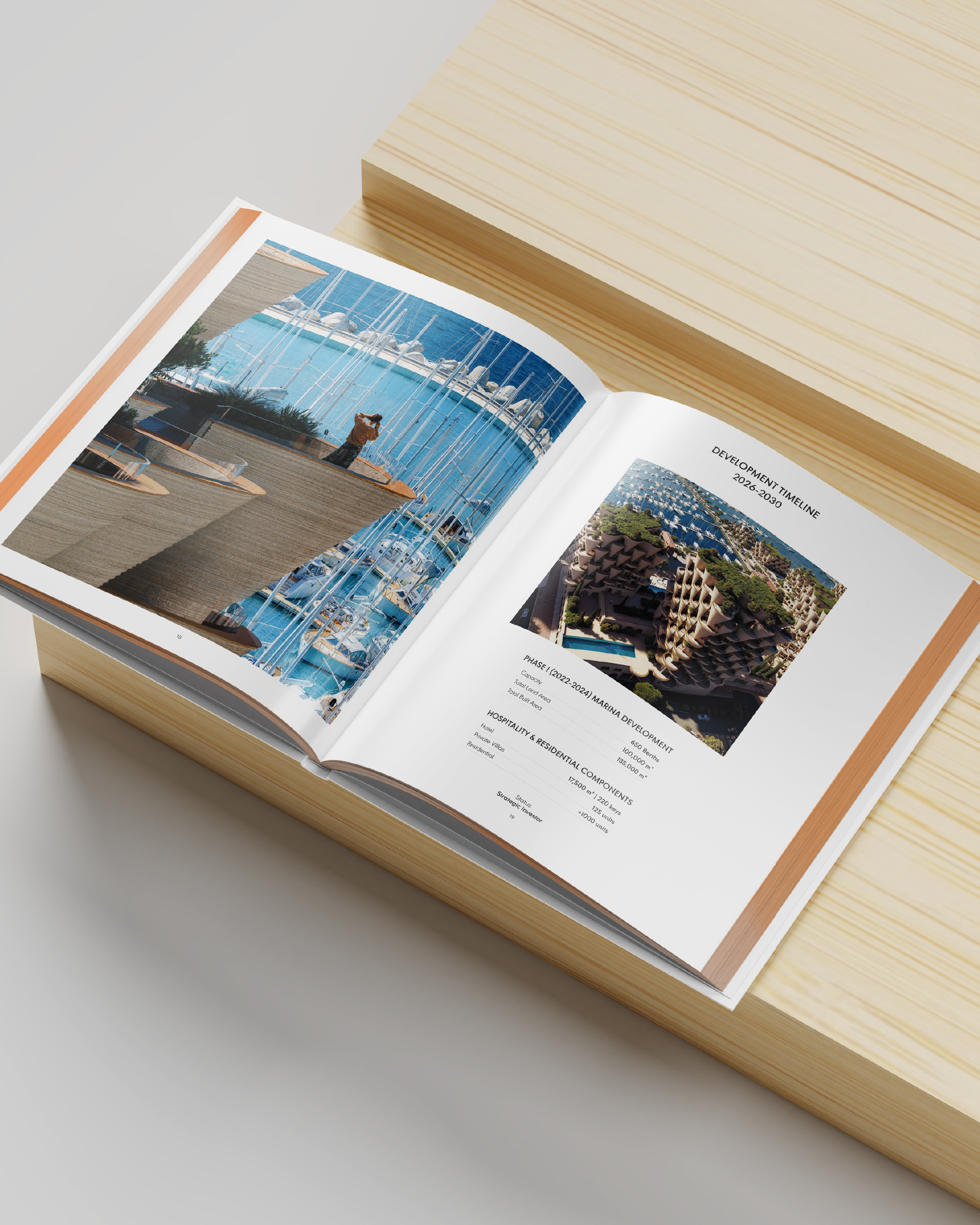
Every project spread was written and designed to carry the same editorial tone: clean, confident, and free of excess. Marina projects, residential towers, hotels, and industrial parks all had to feel like chapters of the same story rather than isolated case studies, guided by consistent typography, imagery, and pacing from cover to close.

Behind the visual system is a wider ambition: a group that keeps growing its list of partners and industries without losing coherence as it does. What emerged is not a static logo package, but a working framework, one built to absorb new partnerships as they come, rather than break under the weight of them.
The result is a brand built for scale, one that can represent a diversified investment group and still read as a single, coherent voice, whether it's leading the conversation or standing quietly behind a partner's name.