SoHealthy
2025
Services
→ Brand Identity
→ Content Creation
→ Advertising
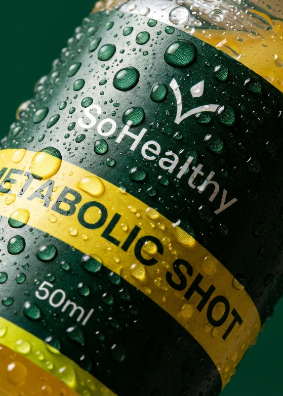
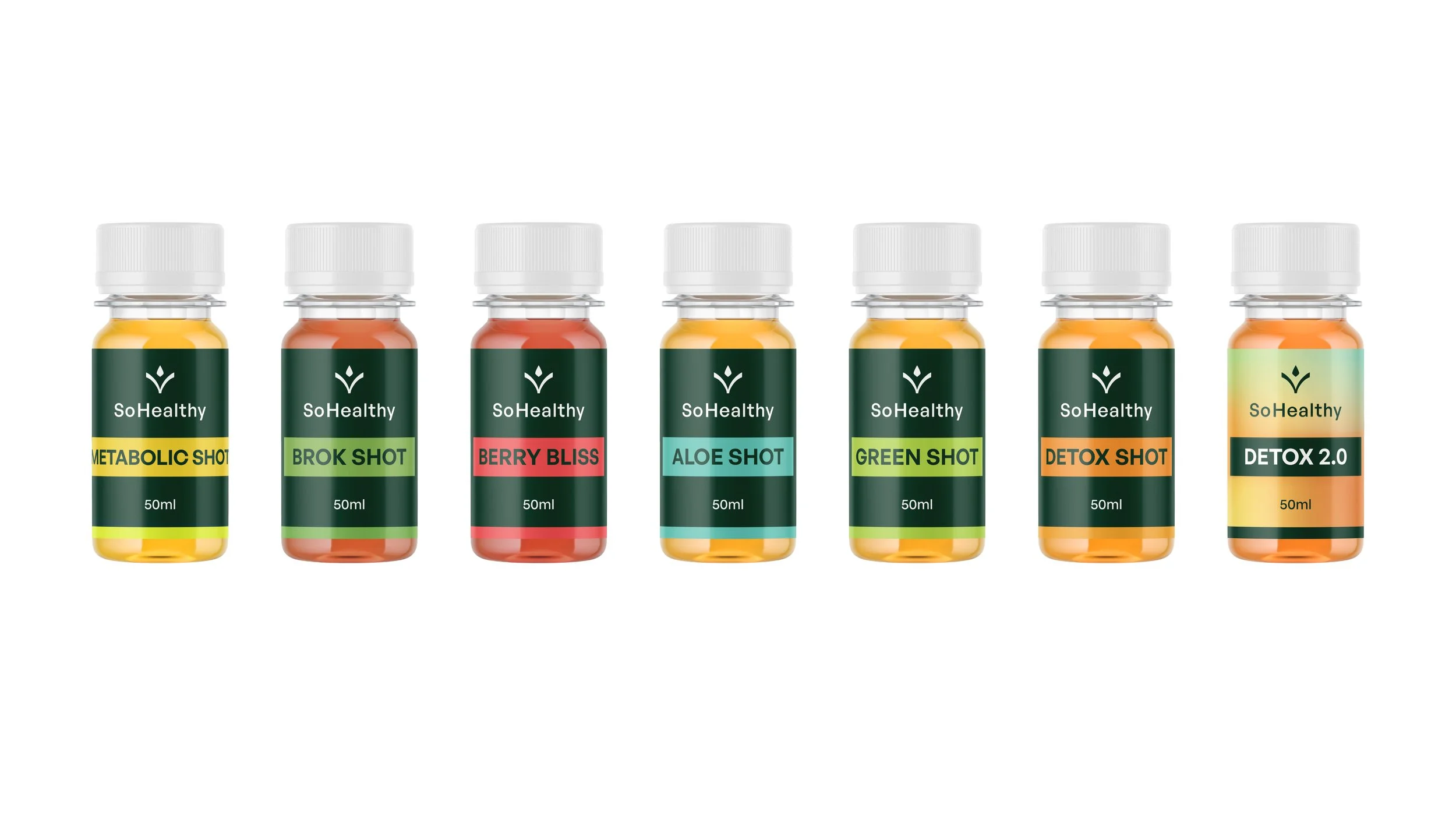
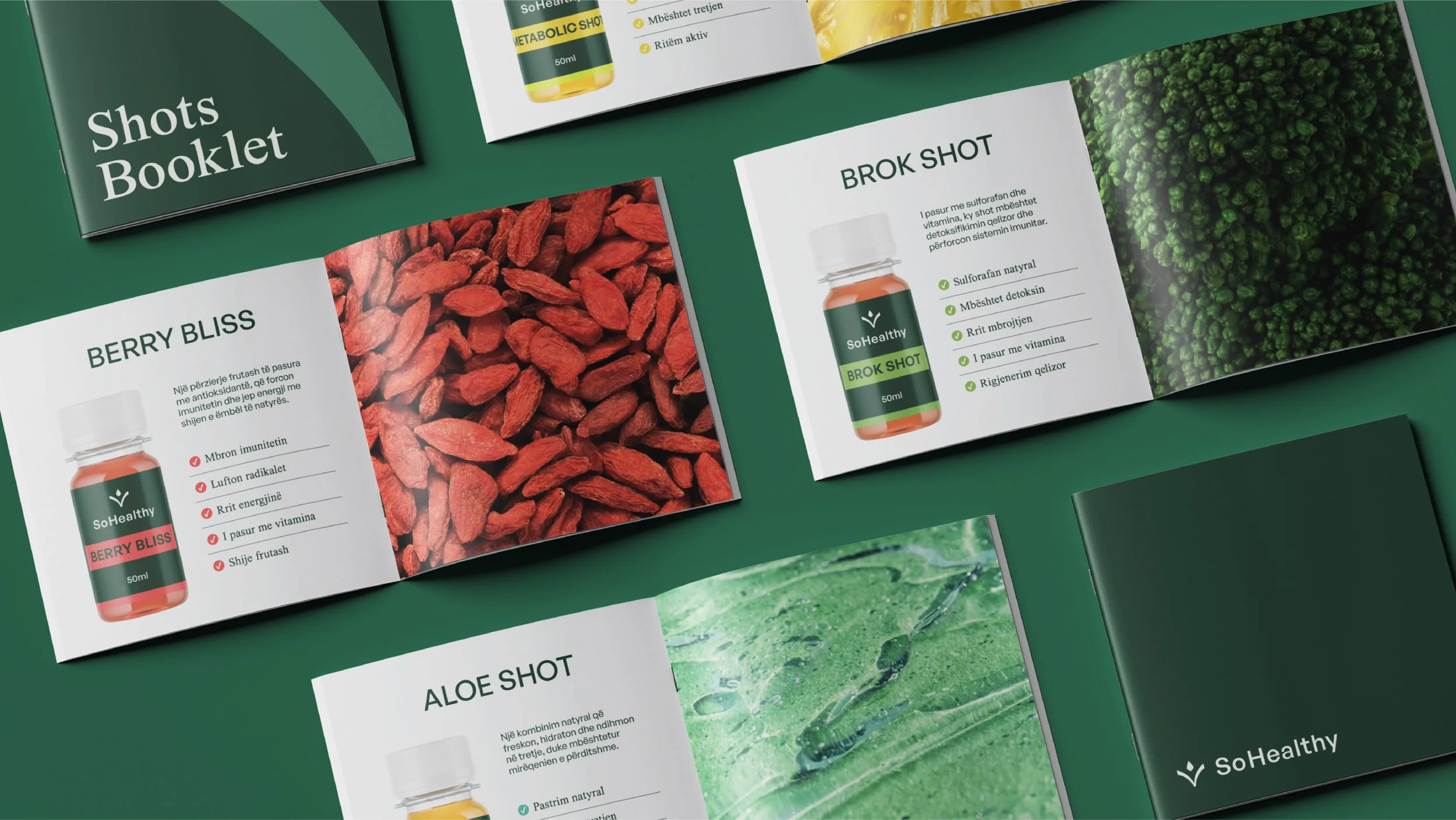
Healthy Shots
Challenge
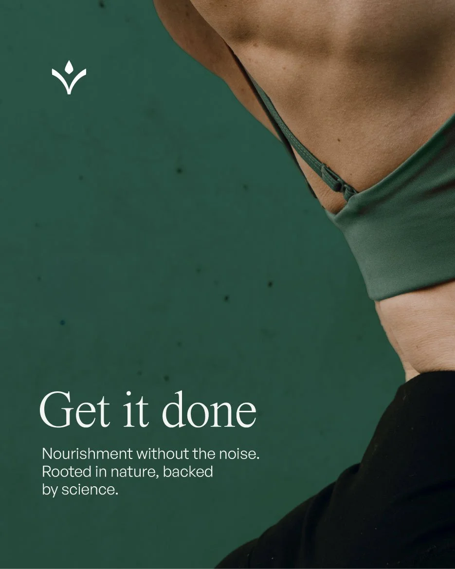
SoHealthy is built for individuals who value discipline, consistency, and real results over empty promises. From the very beginning, SoHealthy has focused on creating clean, purposeful nutritional solutions designed to support daily performance, balance, and vitality. Every formula is carefully developed to integrate seamlessly into modern routines, practical, effective, and easy to commit to.
Driven by the belief that progress is built through small, repeatable actions, SoHealthy connects wellness with momentum. Its philosophy is simple: remove excuses, reduce complexity, and empower people to move forward, one intentional step at a time.
The goal was to shape a brand that feels clear, disciplined, and functional, while remaining emotionally grounded and highly relatable. From the outset, the focus was on building a visual and verbal identity that mirrors SoHealthy’s philosophy: simplicity, consistency, and action. Rather than adding layers of complexity, the brand system was designed to remove friction, allowing the message, the products, and the routine to speak for themselves.

From the early stages of the project, we sought references outside the typical wellness visual language. The inspiration came from systems rooted in information, structure, and credibility, visual worlds where design exists to organize knowledge, not decorate it.
This approach informed the creation of a brand system where hierarchy, typography, and layout work together to communicate purpose and trust. Every element is designed to feel researched, intentional, and grounded, allowing information to be delivered clearly, without visual noise or excess.
The result is a visual language that feels elevated yet practical, modern yet disciplined. A system that prioritizes understanding over hype, and substance over trends, reinforcing SoHealthy’s commitment to action, consistency, and informed choices.
At its core, the system reflects SoHealthy’s balance between action and care, discipline and accessibility. Precision is present in structure and hierarchy, while warmth emerges through tone, spacing, and rhythm. The result is a visual language that feels confident and grounded, yet human.
Layouts, visual cues, and supporting elements are carefully sequenced to ensure clarity and consistency across every touchpoint, from digital platforms to packaging and communication materials. Within this framework, there is room for flexibility and expression, allowing the brand to adapt without losing coherence. The system is built to be lived with daily: functional, intuitive, and quietly motivating, supporting routines rather than overwhelming them.
Just as SoHealthy’s products are designed to support progress through consistency and refinement, the logo follows the same principle. Subtle adjustments in proportion, balance, and clarity result in an identity that feels sharper, more intentional, and better aligned with modern wellness expectations.
The updated mark reflects forward momentum without losing familiarity, an evolved visual expression that feels disciplined, current, and built to last. A logo designed not to chase trends, but to support a brand committed to long-term routines and real results.
Rather than redesigning from scratch, the focus was on evolution, keeping what already worked and improving the details to better reflect the brand’s maturity and purpose.