

2026
Veronotti Caffè
Coffee Brand
Services
→ Brand Identity
→ Website
→ Content Creation
→ Advertising

Our story
Veronotti Caffè was developed around the idea of bringing a historical story into a contemporary context. Rather than creating a coffee brand from scratch, the project began by establishing a narrative inspired by the origins of coffee culture in seventeenth-century Venice and the legacy of Alessandro Veronotti, a merchant recognized for his dedication to selecting, blending, and roasting exceptional coffee. This historical foundation was not intended as a nostalgic reference, but as a framework for building a brand with depth, character, and a clear point of view.


Challenge
Using this narrative as a starting point, the challenge became translating its values into a visual identity that feels relevant today. Instead of adopting traditional coffee branding or relying on vintage aesthetics, the objective was to reinterpret heritage through a contemporary design language. The result is an identity that acknowledges its inspiration while remaining clean, confident, and unmistakably modern.
This approach informed every stage of the design process. Rather than treating the logo, typography, and color palette as separate elements, they were developed together as parts of a unified visual system. The symbol became the central element of the identity, supported by carefully balanced typography, a restrained color palette, and a structured composition that reinforces clarity and consistency across every application.
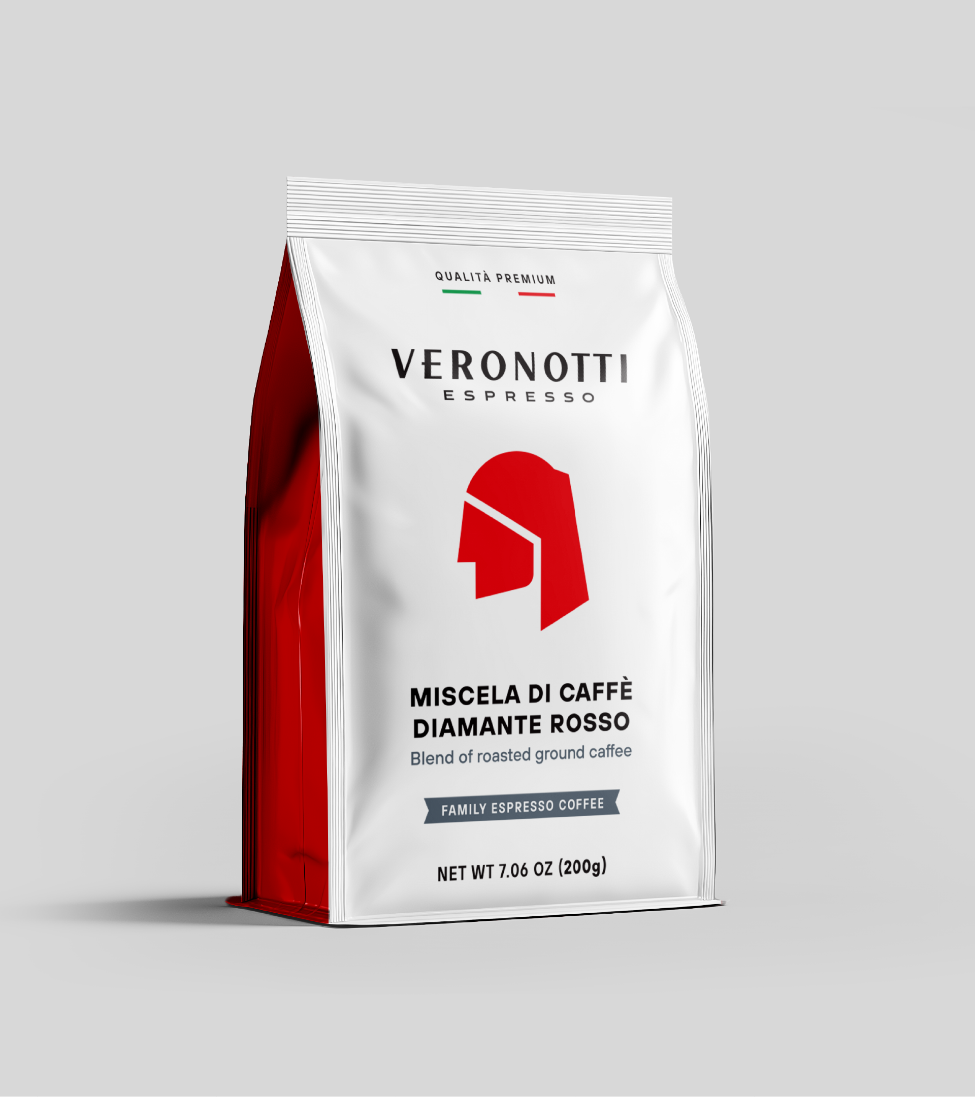
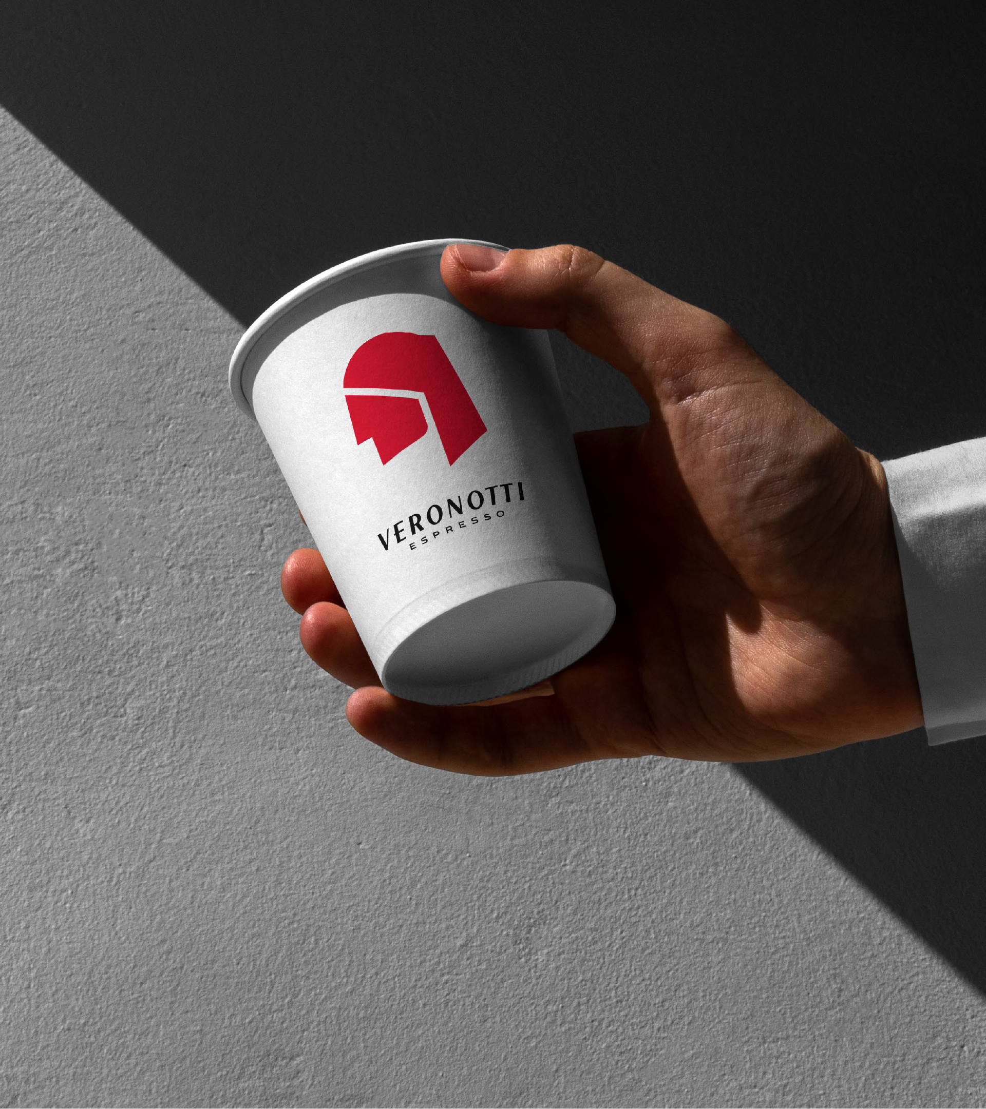
Each decision was made to ensure the identity could remain recognizable while adapting naturally to different formats and environments.
With these principles established, the identity was developed as a complete ecosystem rather than a collection of individual assets. Packaging, coffee bags, capsules, takeaway cups, apparel, stationery, and branded merchandise were all designed within the same visual framework, ensuring every touchpoint contributes to a consistent and recognizable experience.
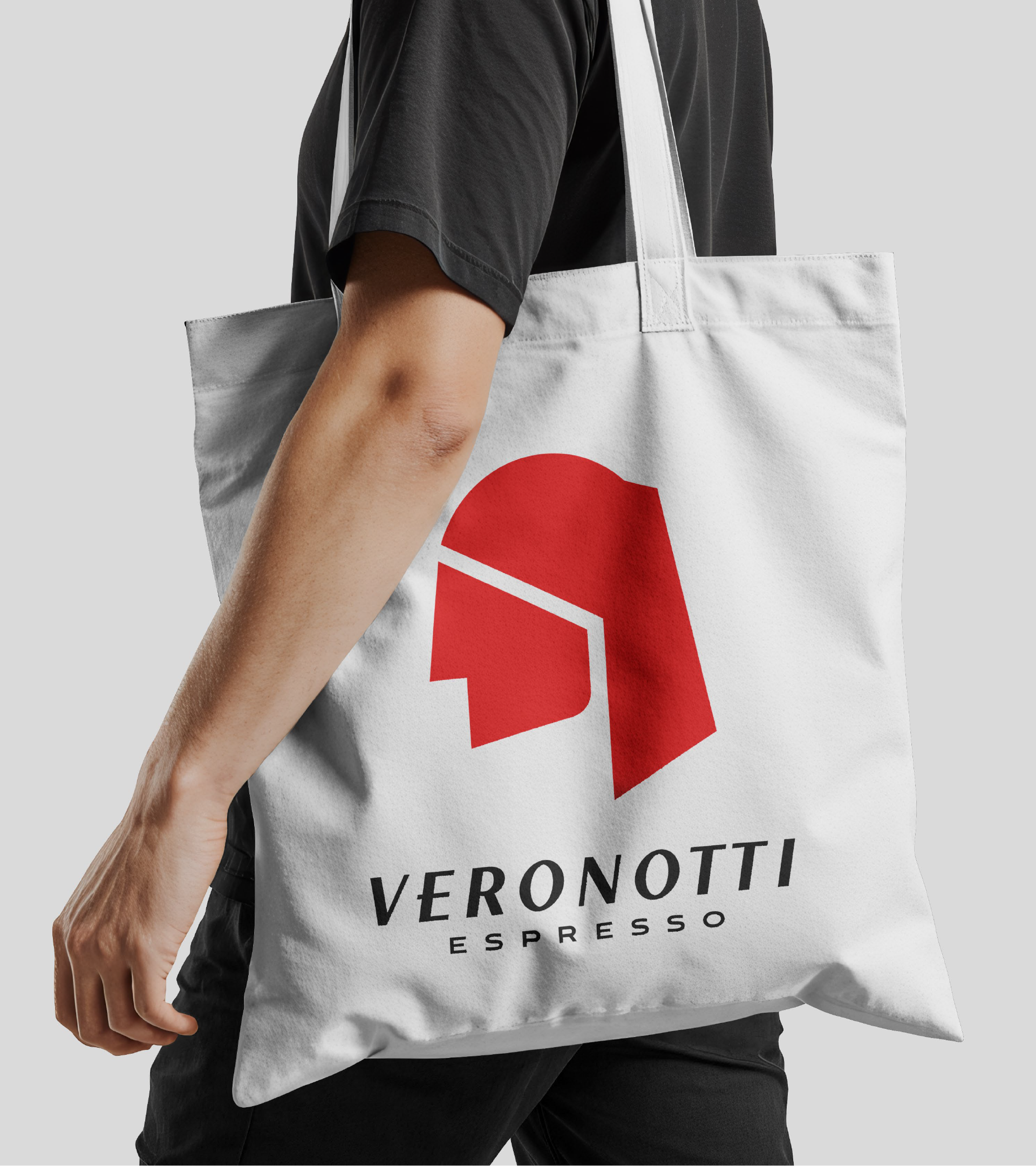
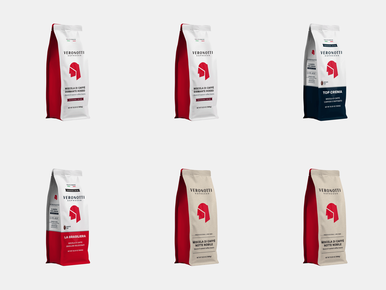
Regardless of scale or medium, each application reinforces the same design language while remaining functional and appropriate for its context.

As the system expands across these touchpoints, the strength of the identity lies in its ability to remain both functional and distinctive. Each application contributes to a unified brand presence, allowing Veronotti Caffè to be immediately recognizable while adapting effortlessly to different contexts.
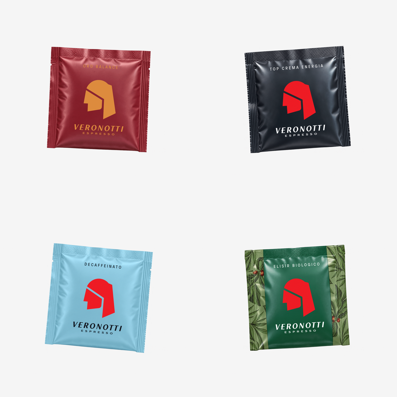
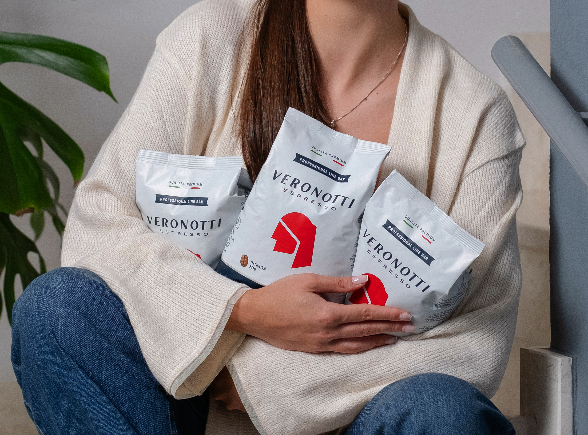
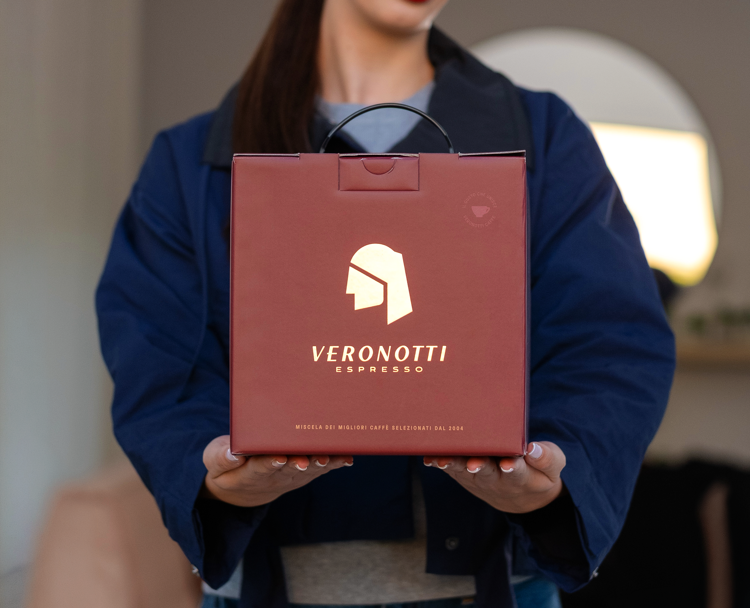
Throughout the project, the emphasis remained on building a brand rather than simply designing packaging. Every application became an opportunity to reinforce the same visual principles, allowing the identity to establish recognition through repetition rather than relying on individual graphic elements.
The result was a cohesive identity that extended naturally across every brand application, ensuring each new element contributed to a stronger and more unified brand presence.

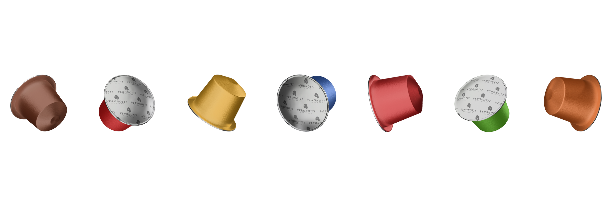

This consistency also supported the brand's long-term vision, allowing future developments to integrate seamlessly within the existing design system. As the brand evolves, the identity provides a stable framework that can accommodate new ideas without losing its visual coherence.



The digital experience follows the same philosophy. The website was designed as a continuation of the physical identity, translating the established visual system into an intuitive interface that prioritizes clarity and ease of navigation.
Typography, spacing, imagery, and interaction work together to create a cohesive experience that presents the products while maintaining the same visual consistency found across the brand's physical applications.

Ultimately, the project demonstrates how a strong narrative can become more than a storytelling device. By using history as a conceptual foundation rather than a stylistic reference, Veronotti Caffè presents a contemporary interpretation of a centuries-old coffee tradition. The result is a brand identity that is coherent, adaptable, and built around a clear design strategy, allowing every visual and digital touchpoint to contribute to a single, recognizable brand experience.