OMAA
2025
Food industry
Services
→ Brand Identity
→ Positioning
→ Packaging
Challenge
OMAA is a premium food brand under EVEREST IE, a company founded in 1995 and well-established in the Albanian market. Since 2017, EVEREST IE has expanded into the food sector as the exclusive distributor of renowned international brands such as TADIM.
Built on core values such as quality, freshness, innovation, premium standards, certification, and affordability, OMAA aims to deliver high-quality food products to the Albanian and regional market.

Our work encompassed the full brand development process starting with naming the brand. The name OMAA draws inspiration from a familiar and heartfelt moment in Albanian culture: the affectionate call a child makes to their mother when seeking comfort, support, or attention. This warm, simple, and emotionally resonant sound became the foundation of a brand designed to feel caring, trustworthy, and close to home.
We then developed the entire visual identity and packaging system, focusing on a clean, modern aesthetic that communicates freshness, reliability, and a strong premium positioning. The design balances clarity with emotional warmth, supporting the brand’s mission to become a natural part of everyday life.
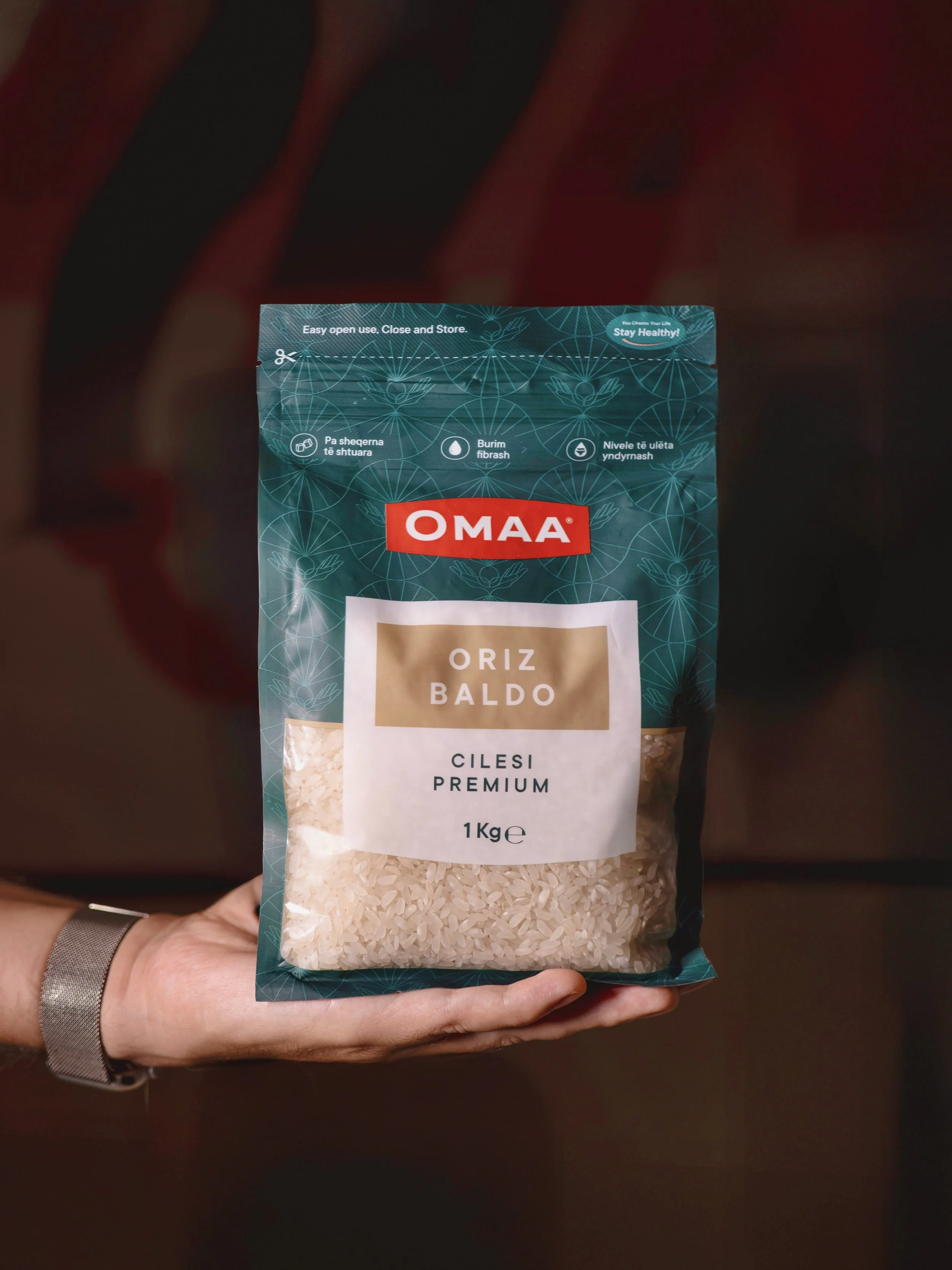
The main challenge was market positioning, as the category is highly saturated with similar products. Our first step was an in-depth analysis of shelf presence and competitor landscape, allowing us to understand existing visual codes and identify opportunities for differentiation. This process enabled us to develop an authentic, distinctive design that stands out on the shelf while simultaneously conveying a premium product perception, aligned with the brand’s quality and values.
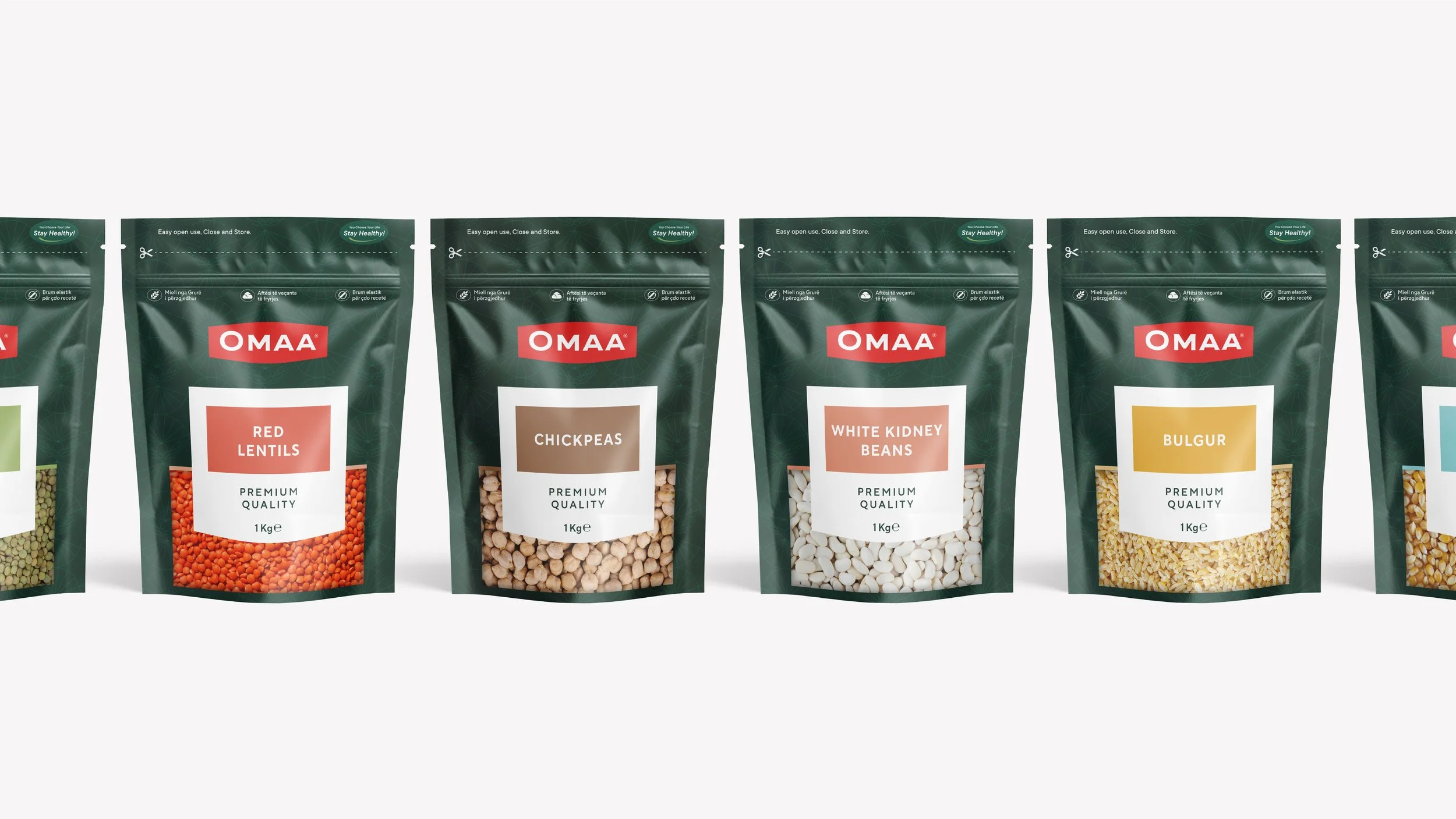
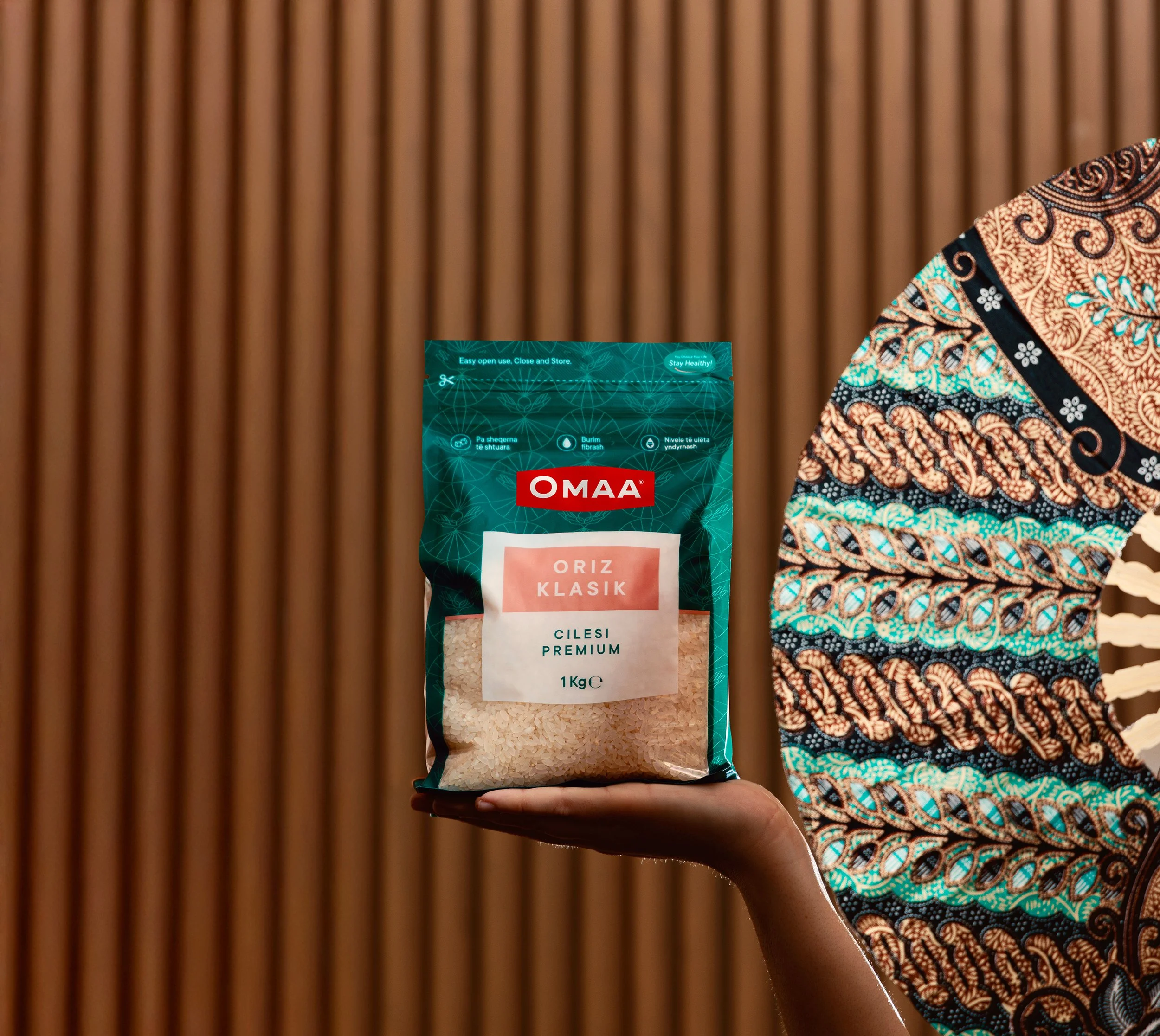
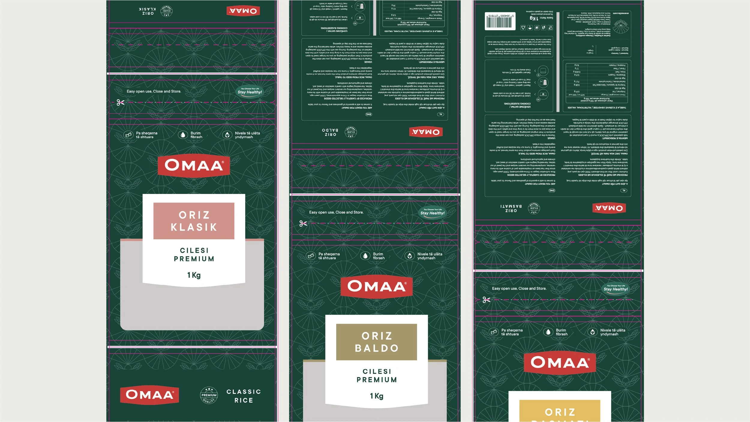
Following our research, we identified that green was largely absent from the shelf, creating a clear opportunity for differentiation. The selected green conveys a premium feel while allowing the product to stand out effortlessly from competitors. Placing the brand logo on top creates a strong visual contrast against the background, enhancing legibility and reinforcing brand recognition at first glance.
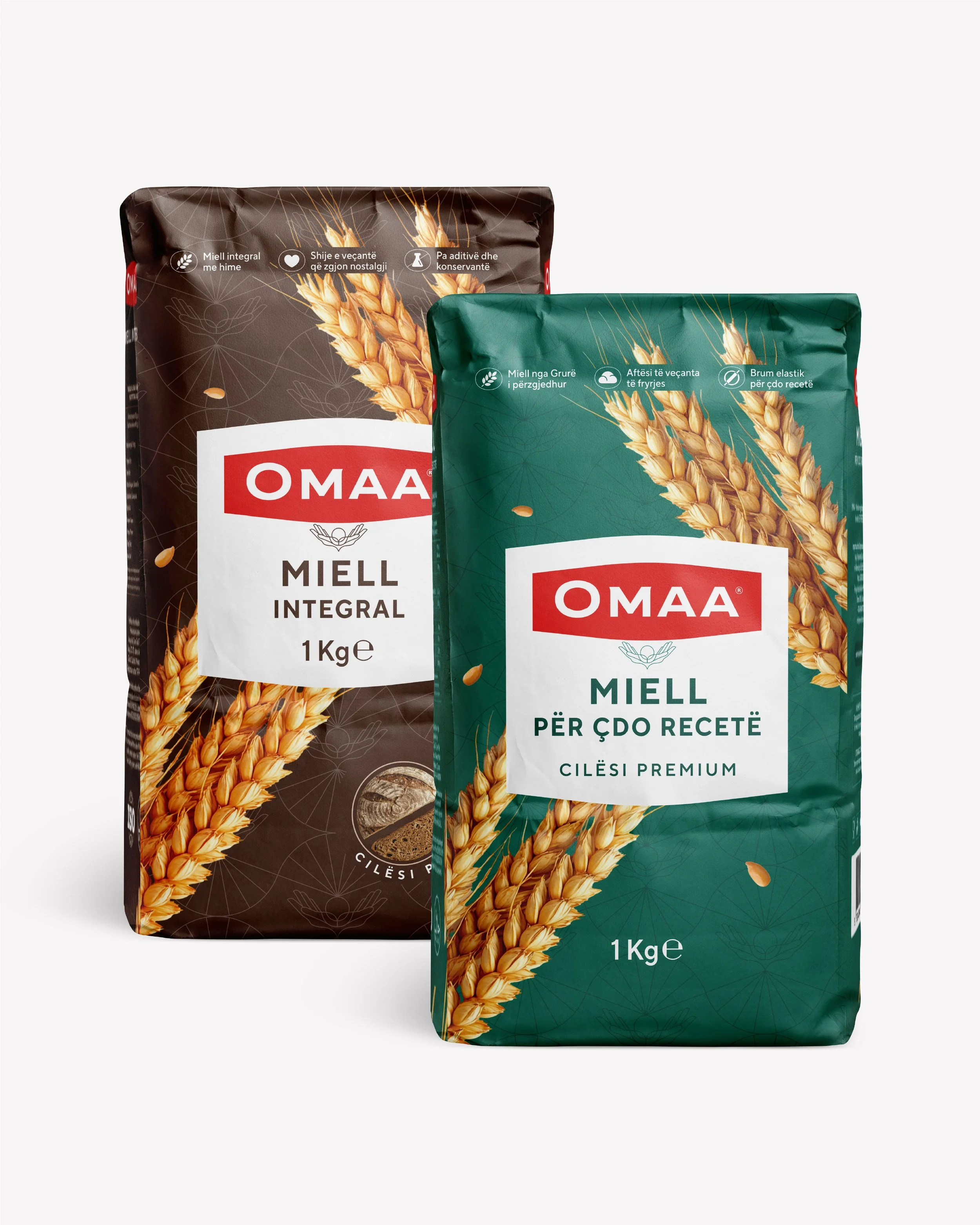

Through a considered combination of typography and form, we achieved clear and effortless readability, while consistently applying all key brand elements. These elements establish a strong visual system that will continue to define and support Omaa across all future applications, ensuring coherence, recognition, and long-term brand consistency.
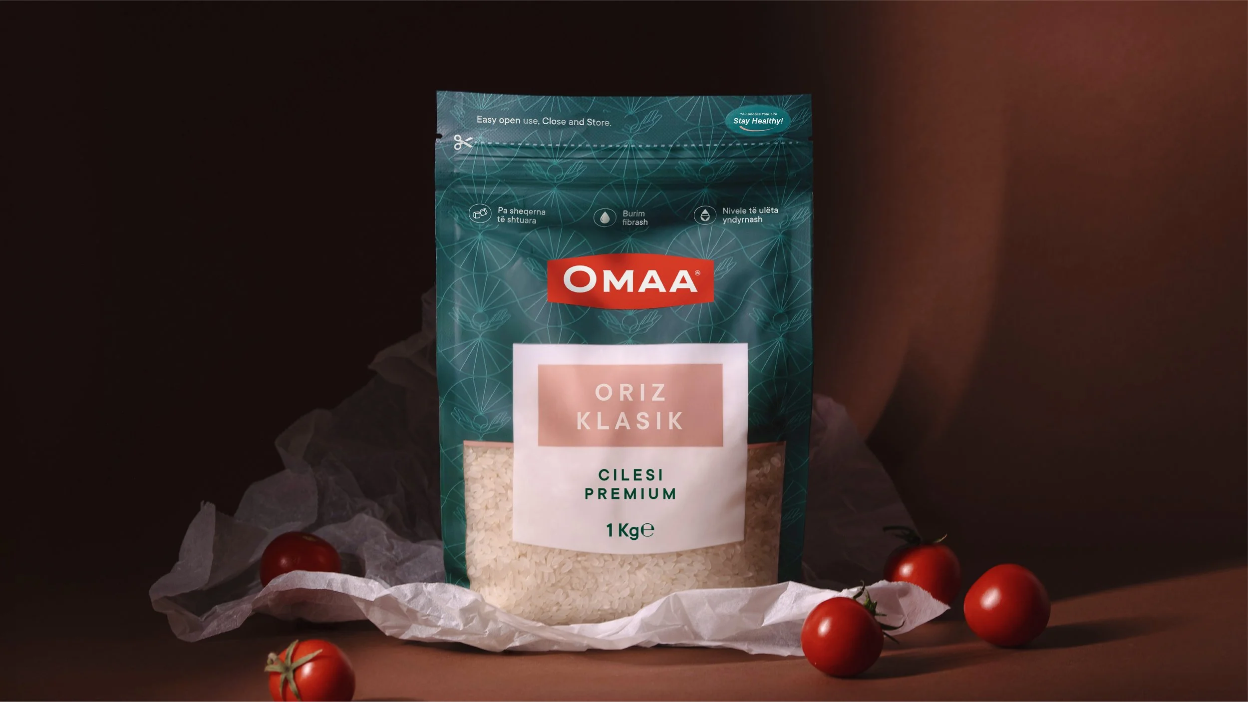
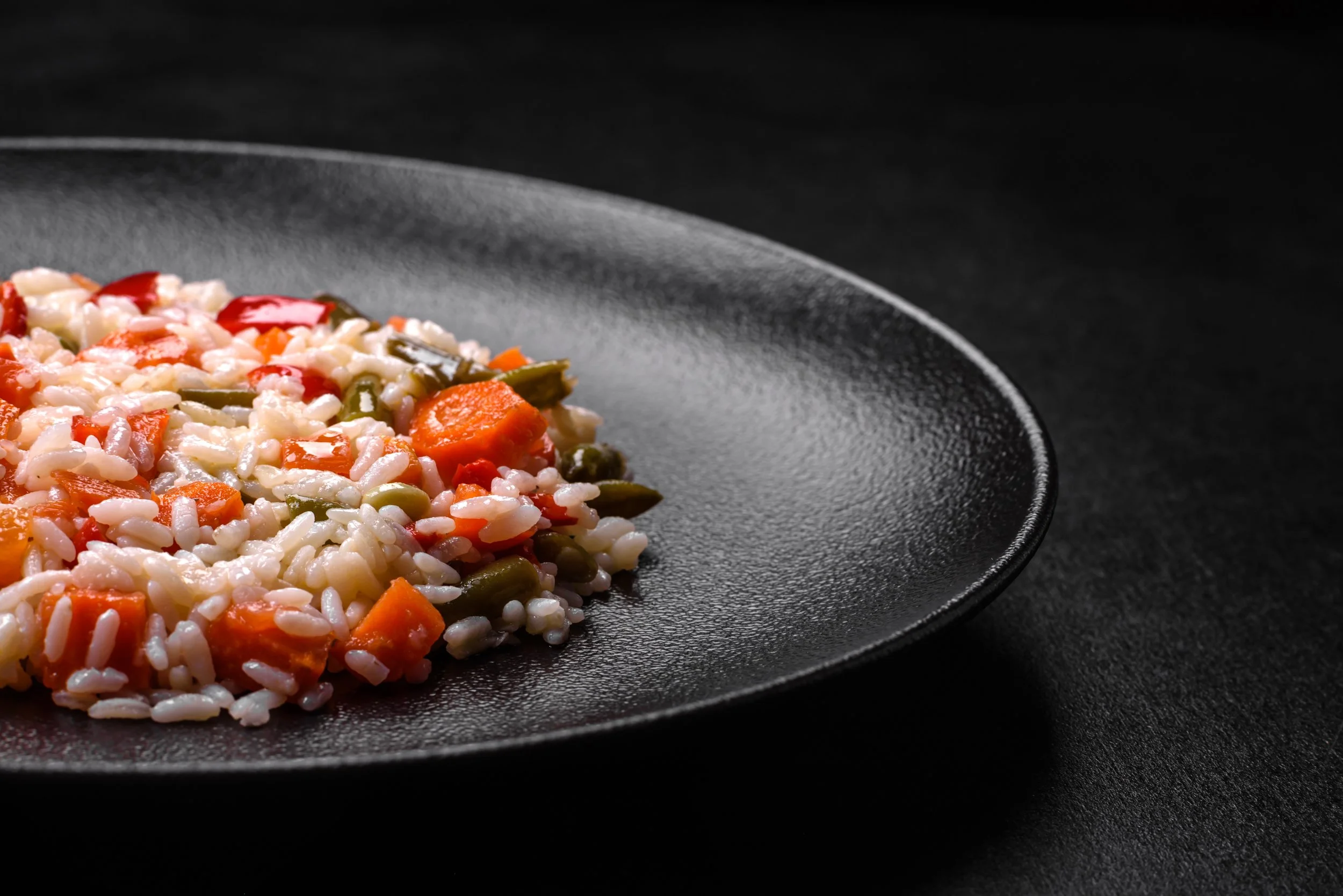
Omaa is a brand defined by care, quality, and flavor, designed to elevate every cooking experience. Most importantly, these values are communicated from the very first interaction, through sight, touch, and ultimately taste. The consumer is not simply holding another package, but experiencing a thoughtfully crafted sensation that preserves quality and conveys care for everyone who values excellence in cooking.